

Google Drive iOS App - Darkmode
Delivering a seamless dark mode experience that improves usability for over a billion Google Drive users
Launched on July 2022
Challenges
When I joined Google, the mobile design role had been vacant for nearly a year across three different engineering teams. As a result, multiple mobile projects were on hold and the teams had been waiting for a designer to join so they could move forward. There was no structured onboarding period and I began contributing immediately, even traveling to Denver during my first week to participate in a team workshop and align on priorities. At that time, Drive had no established mobile design foundation for several key areas including visual patterns for dark mode, empty states, file views and folder customization. I needed to quickly assess the existing gaps, unify design direction across teams and define a scalable mobile design system that could support rapid engineering execution.
My Role: Lead Designer
I stepped in as the mobile product designer responsible for defining the user experience across multiple engineering teams. I quickly aligned stakeholders, established design priorities and provided clear direction for the components and flows that were missing from the product. I created end to end designs for dark mode, empty states, file browsing and folder color customization while working closely with engineering to ensure fast and accurate implementation. I also served as the central design partner across the three engineering teams by providing guidance, resolving inconsistencies and helping the teams adopt a more cohesive approach to the mobile experience. My role required rapid decision making, strong cross functional coordination and the ability to deliver high quality design work without a formal onboarding period.
Challenges
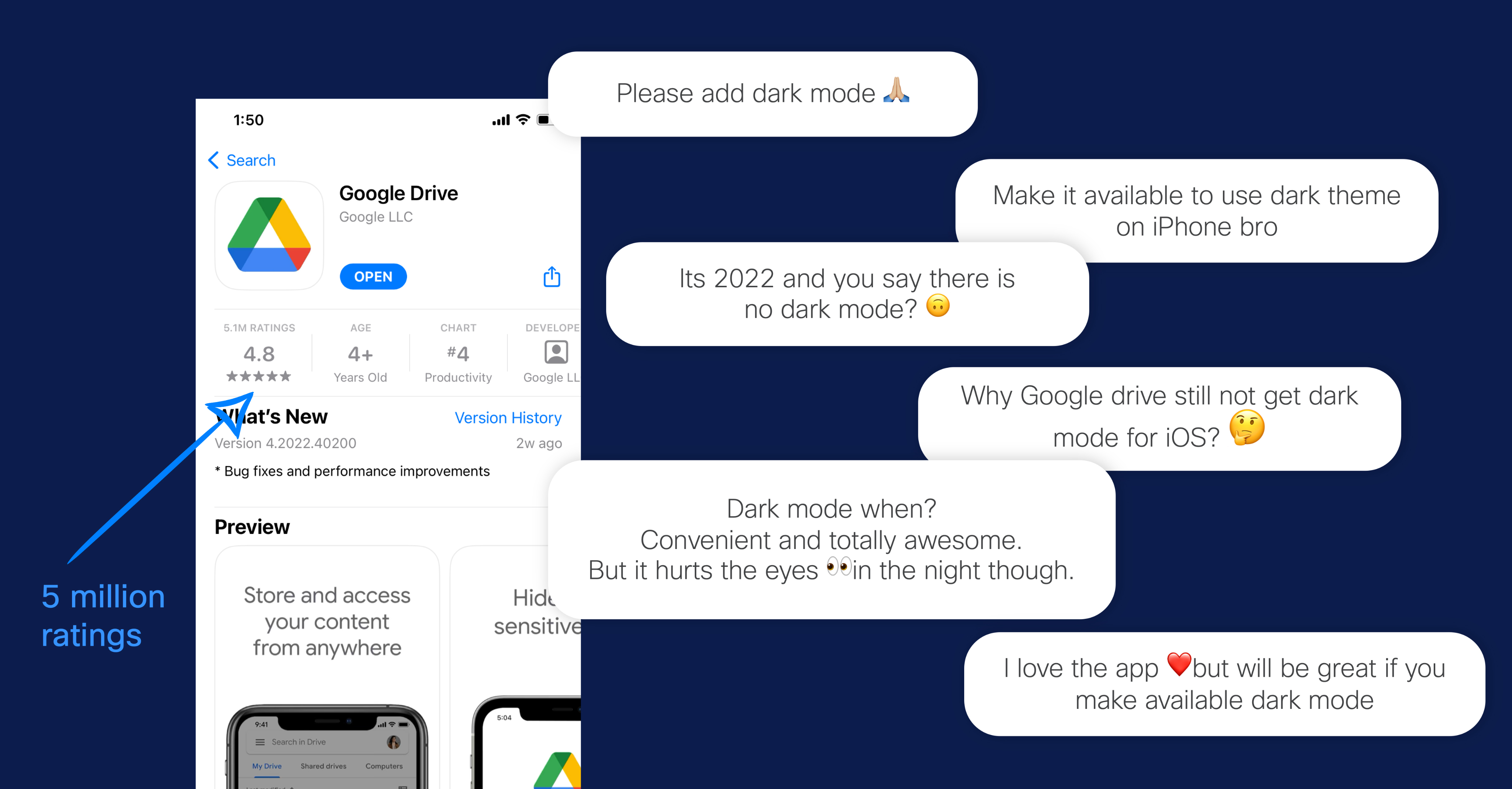
With over a billion users and more than five million public ratings, Drive receives a constant stream of direct, user-generated feedback. This scale provides highly accurate insight into user expectations and unmet needs. A clear pattern emerged across reviews and comments: users consistently requested Dark Mode. They highlighted eye strain, nighttime usability and a general preference for dark UI environments as key reasons. Identifying and responding to this demand became an important challenge to address in order to align the product with user behavior, improve comfort and meet modern UI standards.
Final Look
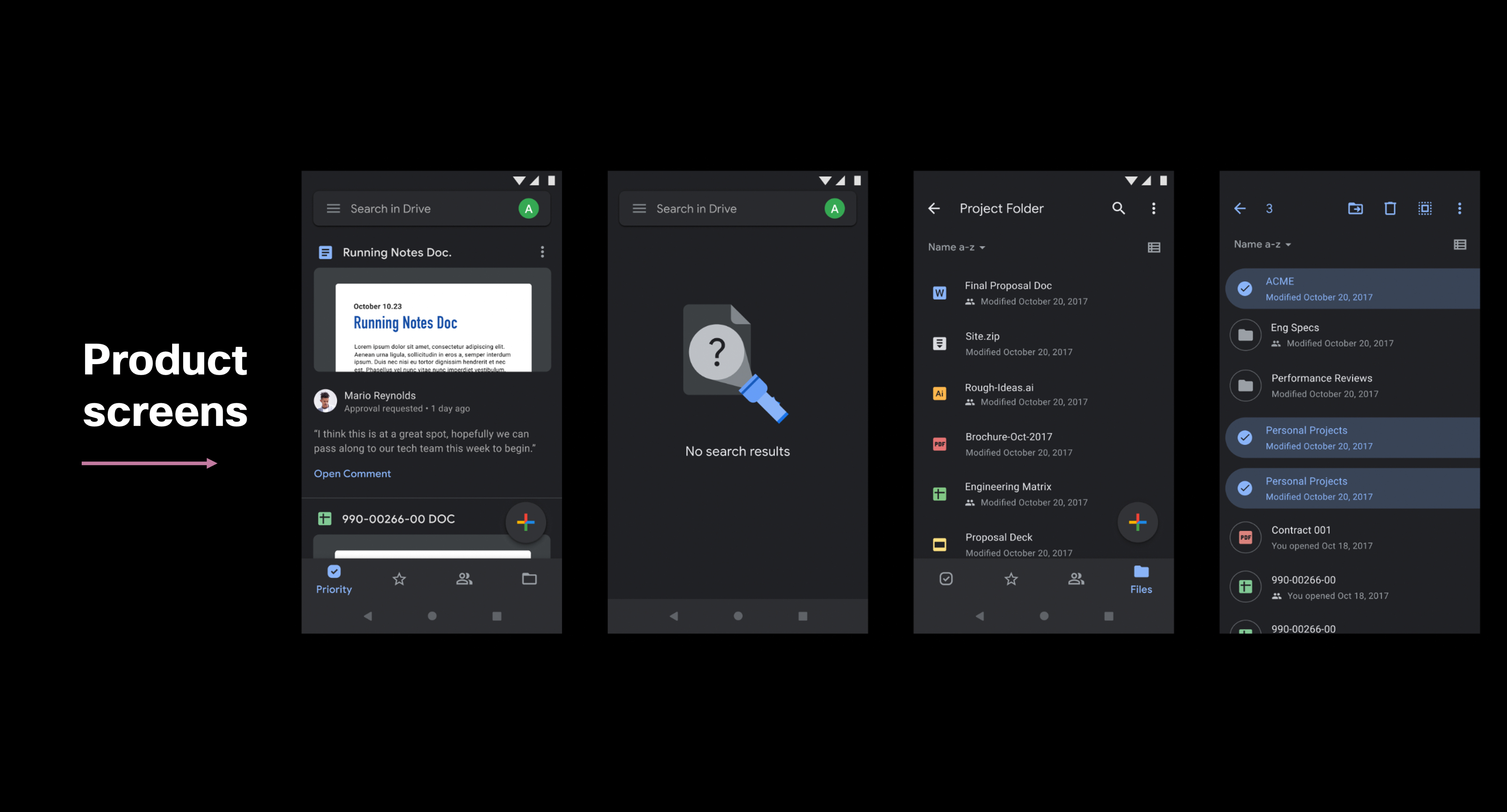
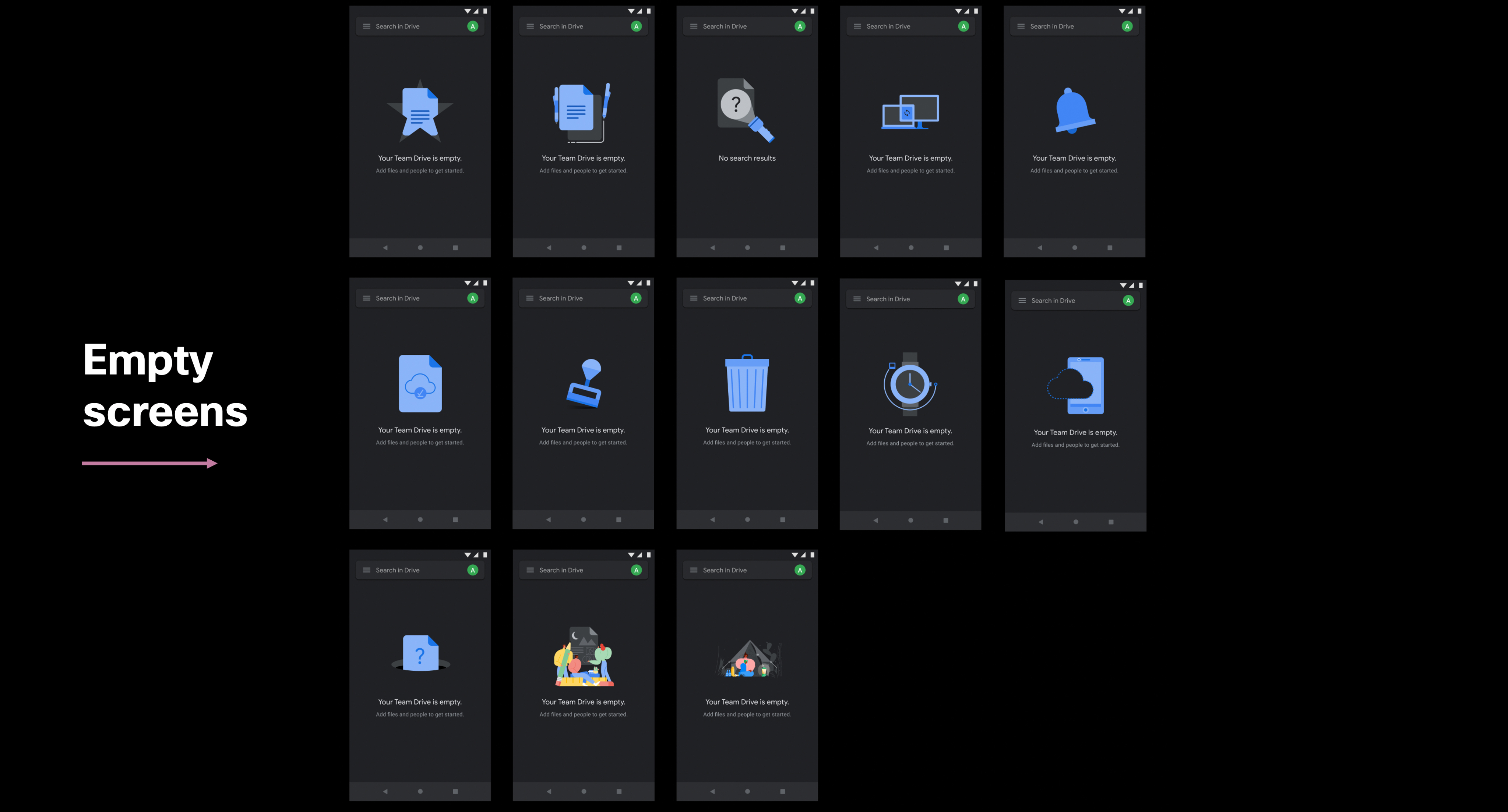
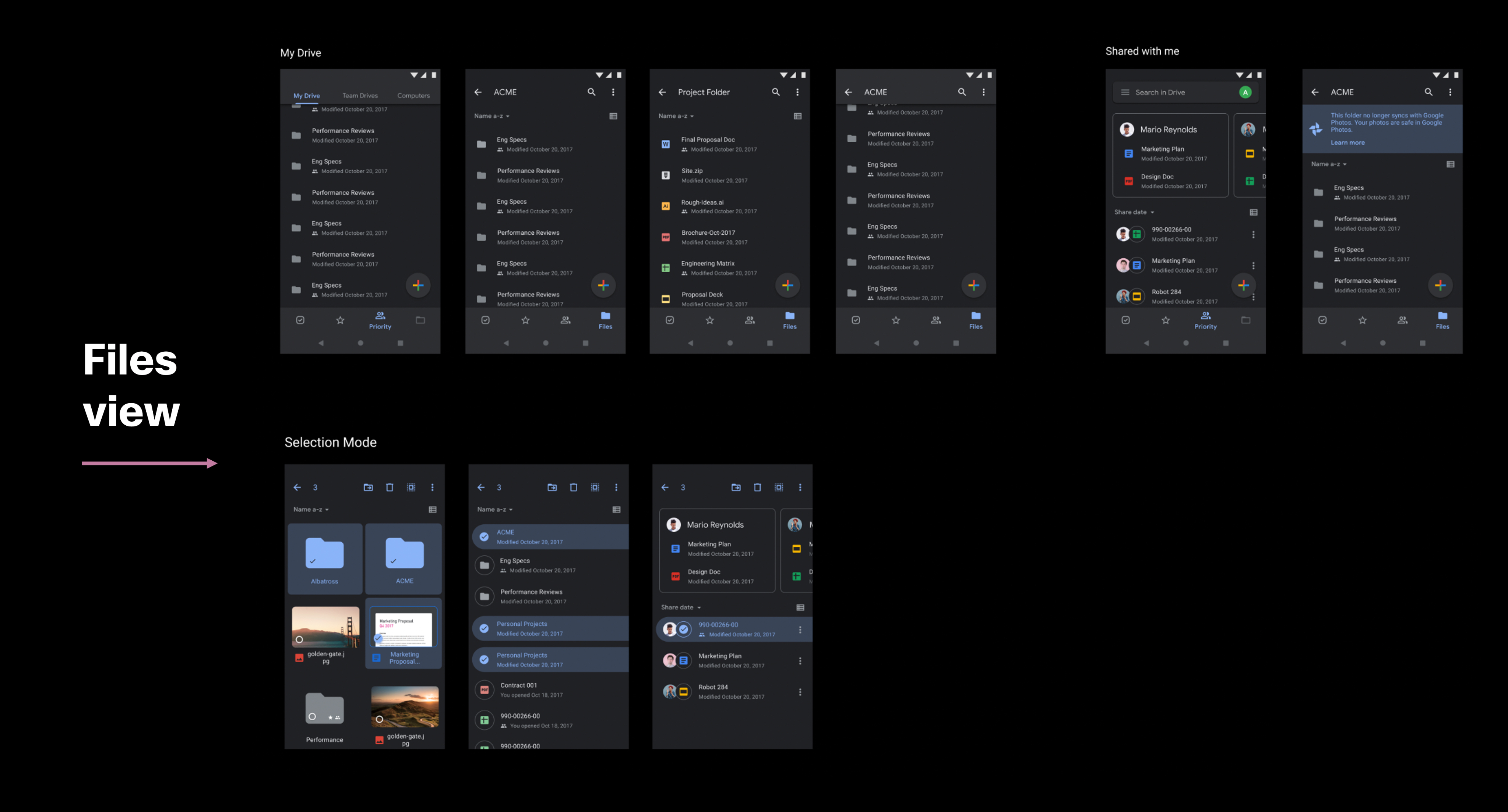
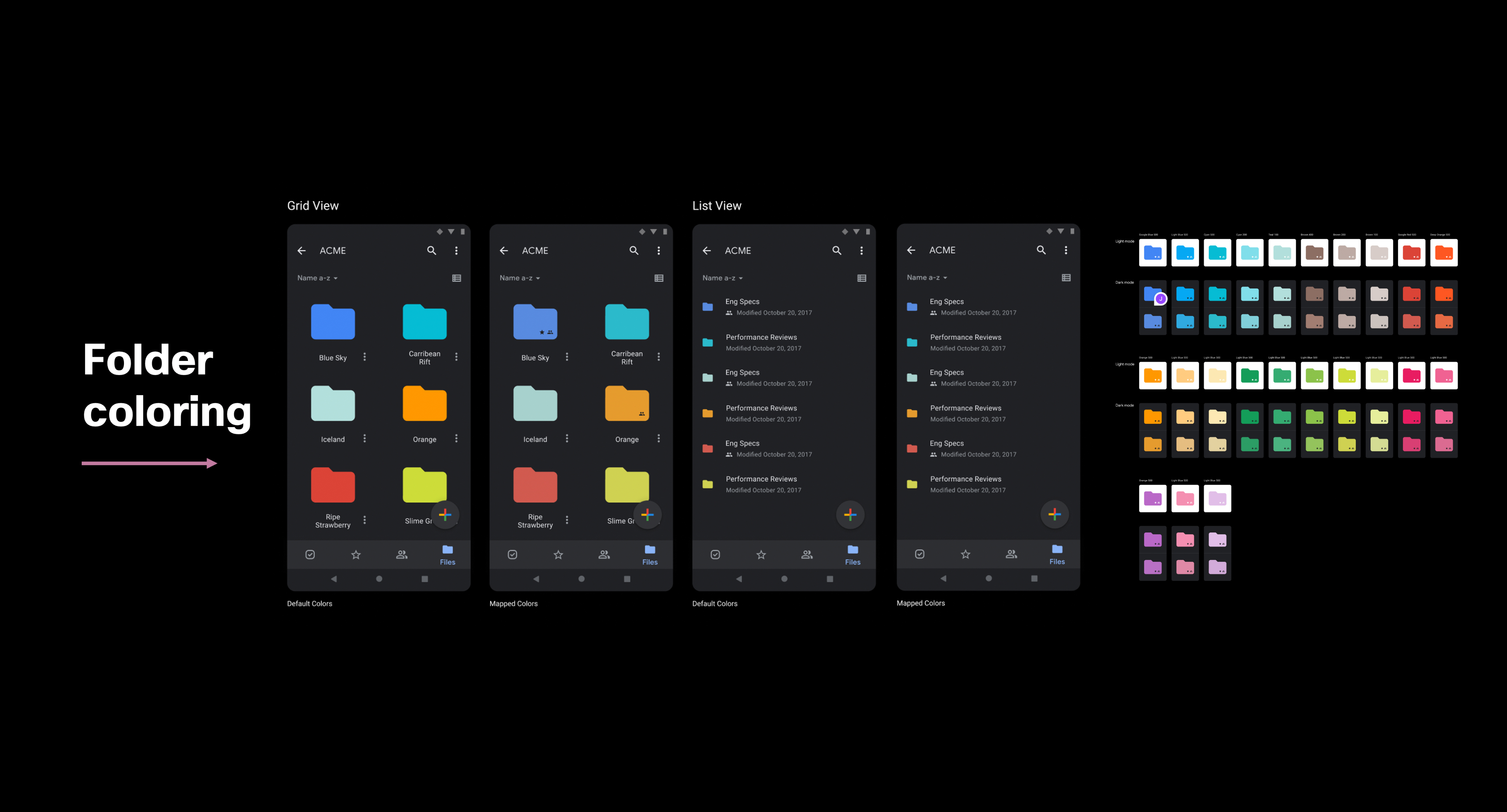
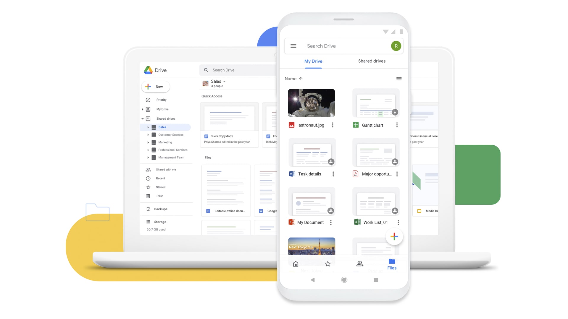
Here are the final product screens including the Priority feed, which serves as the primary entry point and sets the tone for the overall experience. The design includes various empty states such as no notifications, no search results and empty Team Drive folders, each supported with purpose built illustrations to clearly communicate status and guide the user. The files experience is represented across My Drive, Shared with Me and Team Drives with support for both list and grid layouts. A comprehensive folder coloring system was also developed to give users greater control in organizing their workspace through a wide range of color options. All elements come together to create a cohesive and efficient experience for navigating and managing files.
User's Feedback and Impact
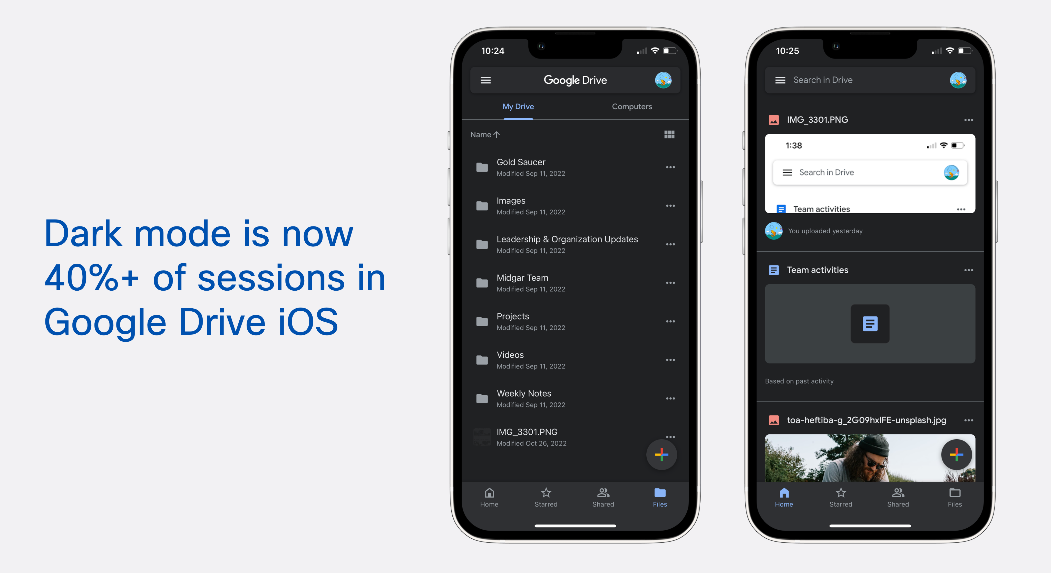
After the Dark Mode launch in July 2022, data showed that approximately 40% of all app sessions were initiated with Dark Mode enabled, and the adoption rate continued to rise. This indicated that nearly half of the active user base preferred the new mode. The feature contributed to higher engagement and improved usability, demonstrating its effectiveness in supporting user productivity and meeting a clear behavioral preference.
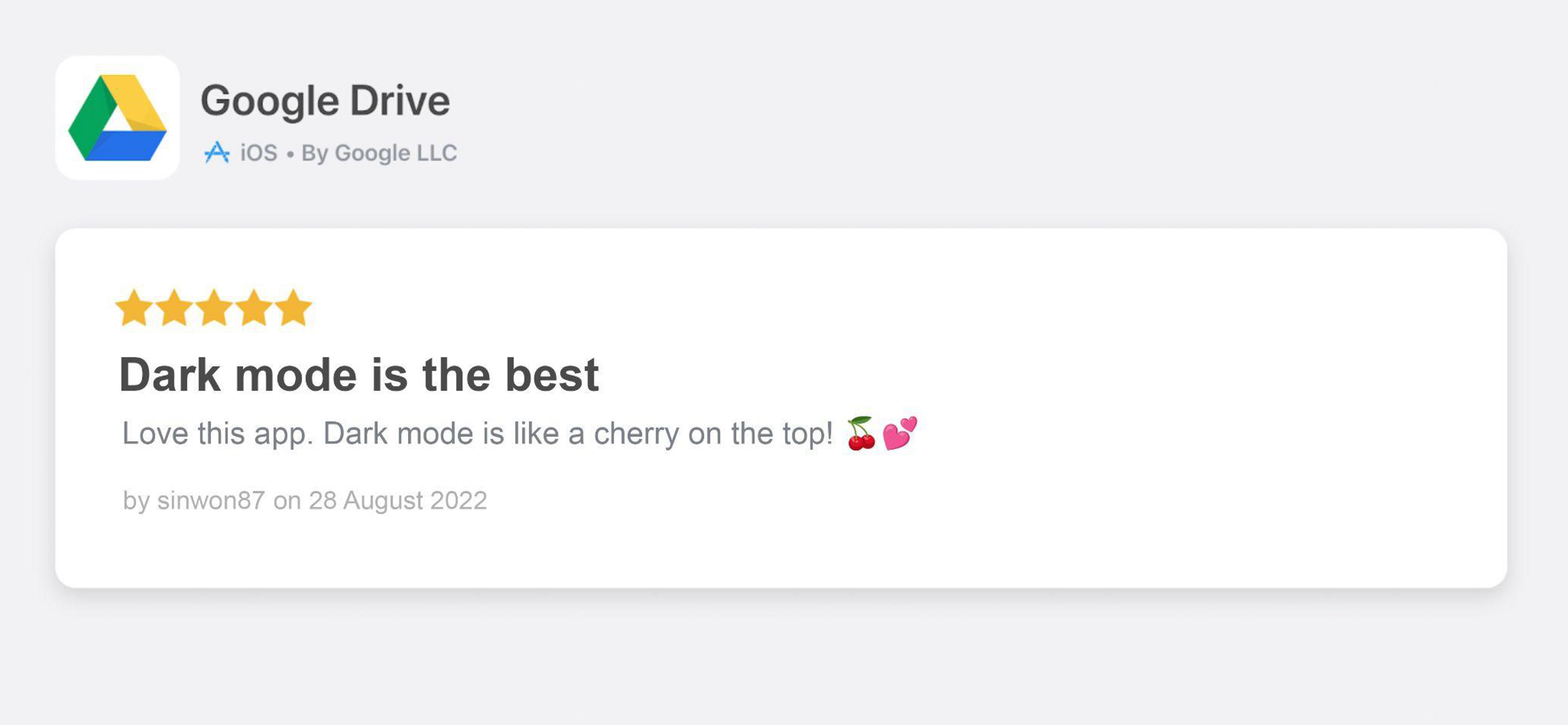
The launch of Dark Mode for Drive generated immediate global attention. Major media outlets, tech blogs, and news platforms quickly covered the update, driving rapid visibility and adoption. On the Apple App Store, the feature received strong positive feedback and high user satisfaction, clearly validating the value and demand for the experience.
This outcome demonstrated the impact of addressing a widely requested user need and highlighted how thoughtful feature enhancements can significantly elevate engagement and perception at scale.

sooyundesign@gmail.com


© Soo Yun Kim 2025 All Rights Reserved
Google Drive iOS App - Darkmode
Delivering a seamless dark mode experience that improves usability for over a billion Google Drive users
Launched on July 2022
Challenges
When I joined Google, the mobile design role had been vacant for nearly a year across three different engineering teams. As a result, multiple mobile projects were on hold and the teams had been waiting for a designer to join so they could move forward. There was no structured onboarding period and I began contributing immediately, even traveling to Denver during my first week to participate in a team workshop and align on priorities. At that time, Drive had no established mobile design foundation for several key areas including visual patterns for dark mode, empty states, file views and folder customization. I needed to quickly assess the existing gaps, unify design direction across teams and define a scalable mobile design system that could support rapid engineering execution.
My Role: Lead Designer
I stepped in as the mobile product designer responsible for defining the user experience across multiple engineering teams. I quickly aligned stakeholders, established design priorities and provided clear direction for the components and flows that were missing from the product. I created end to end designs for dark mode, empty states, file browsing and folder color customization while working closely with engineering to ensure fast and accurate implementation. I also served as the central design partner across the three engineering teams by providing guidance, resolving inconsistencies and helping the teams adopt a more cohesive approach to the mobile experience. My role required rapid decision making, strong cross functional coordination and the ability to deliver high quality design work without a formal onboarding period.
Challenges
With over a billion users and more than five million public ratings, Drive receives a constant stream of direct, user-generated feedback. This scale provides highly accurate insight into user expectations and unmet needs. A clear pattern emerged across reviews and comments: users consistently requested Dark Mode. They highlighted eye strain, nighttime usability and a general preference for dark UI environments as key reasons. Identifying and responding to this demand became an important challenge to address in order to align the product with user behavior, improve comfort and meet modern UI standards.
Final Look
Here are the final product screens including the Priority feed, which serves as the primary entry point and sets the tone for the overall experience. The design includes various empty states such as no notifications, no search results and empty Team Drive folders, each supported with purpose built illustrations to clearly communicate status and guide the user. The files experience is represented across My Drive, Shared with Me and Team Drives with support for both list and grid layouts. A comprehensive folder coloring system was also developed to give users greater control in organizing their workspace through a wide range of color options. All elements come together to create a cohesive and efficient experience for navigating and managing files.
User's Feedback and Impact
After the Dark Mode launch in July 2022, data showed that approximately 40% of all app sessions were initiated with Dark Mode enabled, and the adoption rate continued to rise. This indicated that nearly half of the active user base preferred the new mode. The feature contributed to higher engagement and improved usability, demonstrating its effectiveness in supporting user productivity and meeting a clear behavioral preference.
The launch of Dark Mode for Drive generated immediate global attention. Major media outlets, tech blogs, and news platforms quickly covered the update, driving rapid visibility and adoption. On the Apple App Store, the feature received strong positive feedback and high user satisfaction, clearly validating the value and demand for the experience.
This outcome demonstrated the impact of addressing a widely requested user need and highlighted how thoughtful feature enhancements can significantly elevate engagement and perception at scale.
sooyundesign@gmail.com
© Soo Yun Kim 2025 All Rights Reserved