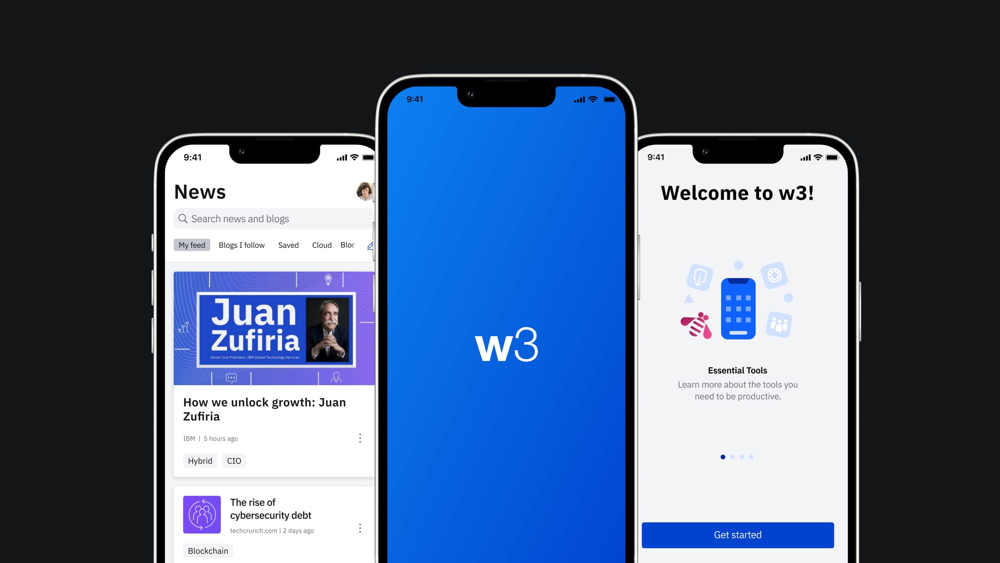
w3 Mobile
Creating an application that proactively provides core tools and services for IBMers
MVP Launched on September 2020
Challenges
We wanted to create an application that proactively provides IBMers with the information they need to be effective at their jobs and informed representatives of the company. Since we introduced a new app that did not exist in the IBM internal ecosystem previously, it was critical to delivering user value with a familiar yet modern and innovative interface. From a visual standpoint, we had no existing design system, so I needed to design most elements from scratch, including certain iconography and graphics. It was also challenging to implement the IBM Plex font on the first native apps.
My Role: Lead Designer
I led a team of UX designers, visual designers and researchers, and oversaw project scope, design direction, delivery, as well as team satisfaction while working on the project. Additionally, I brought my mobile design expertise to the team and educated them by conducting design workshops. I worked with the CIO’s multidisciplinary teams and ensured w3 Mobile was consistent with other w3 experiences.
Process
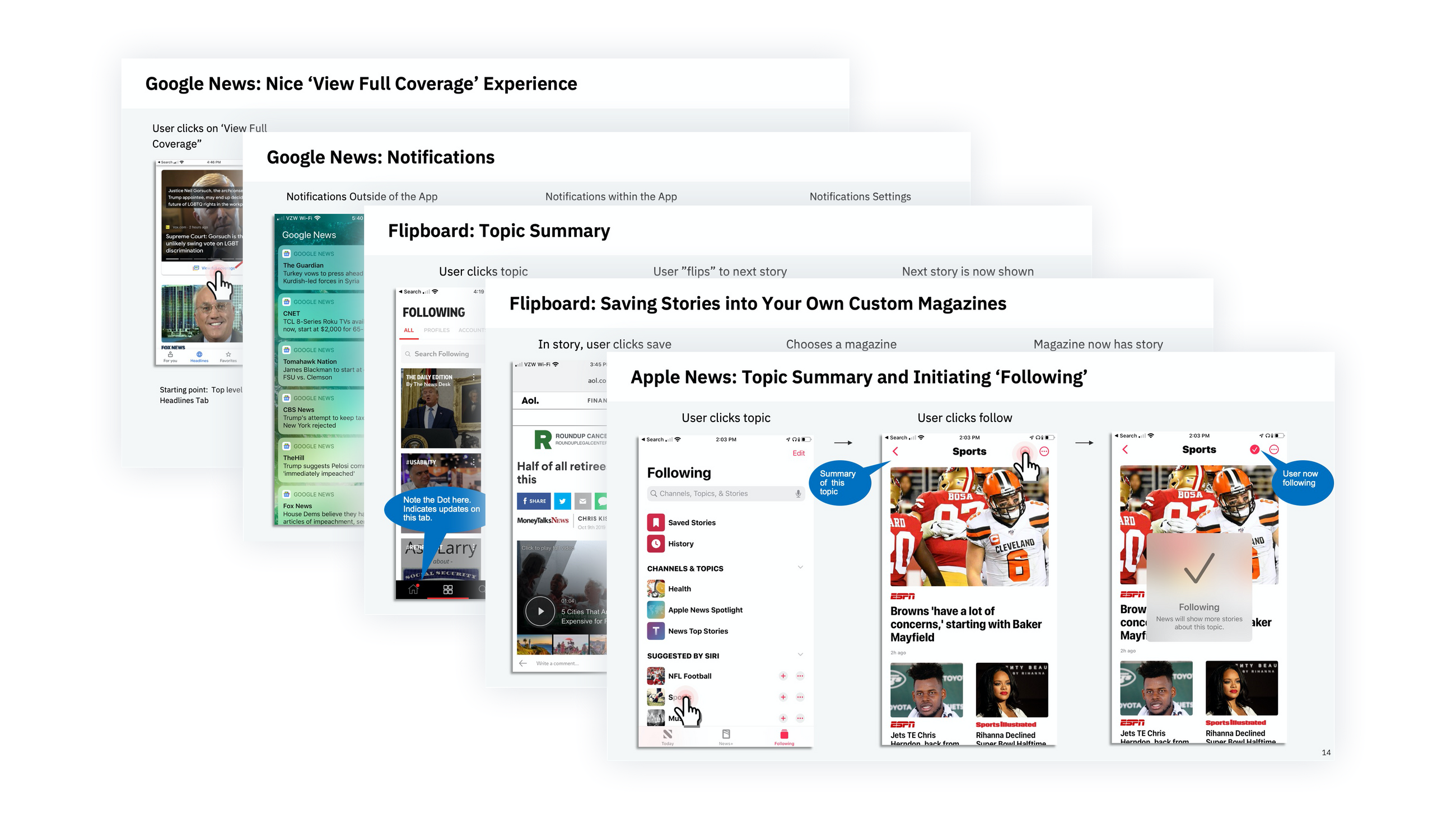
I was involved in every stage of the design process, including competitive evaluation and preliminary research to understand our target users and to create the initial personas.
Discovery Session
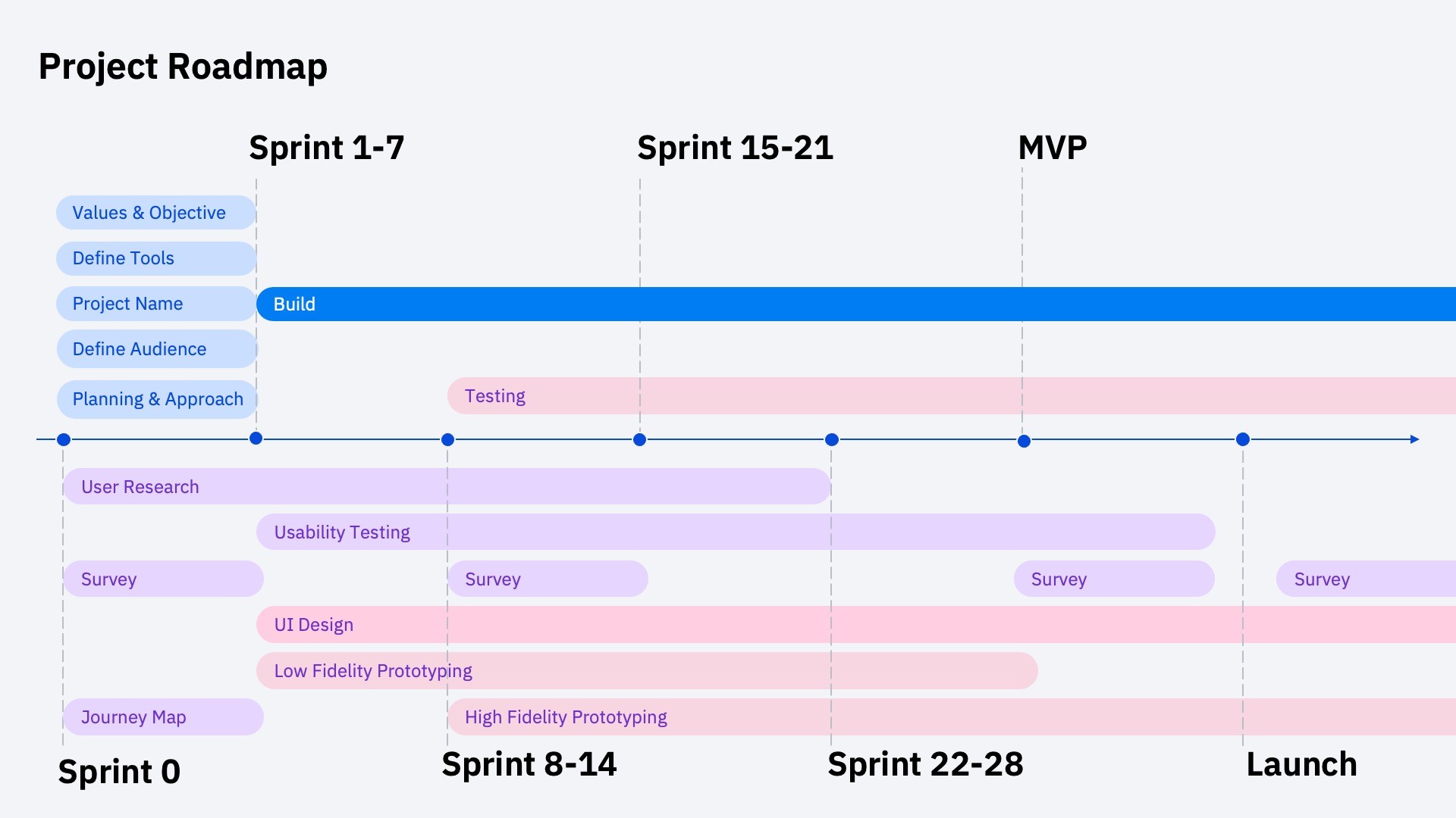
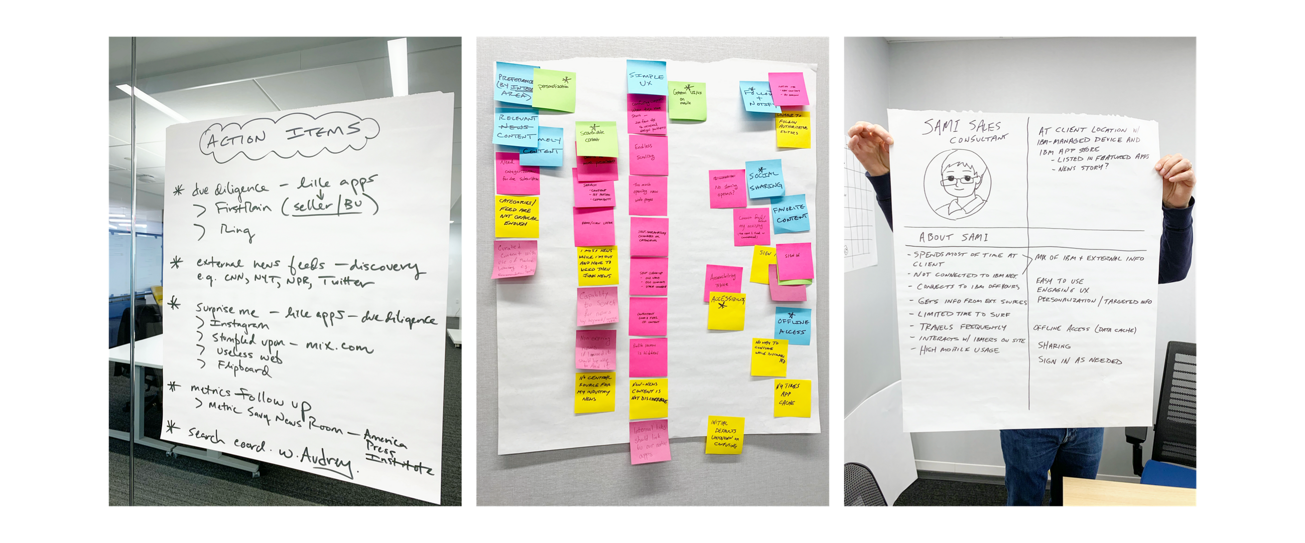
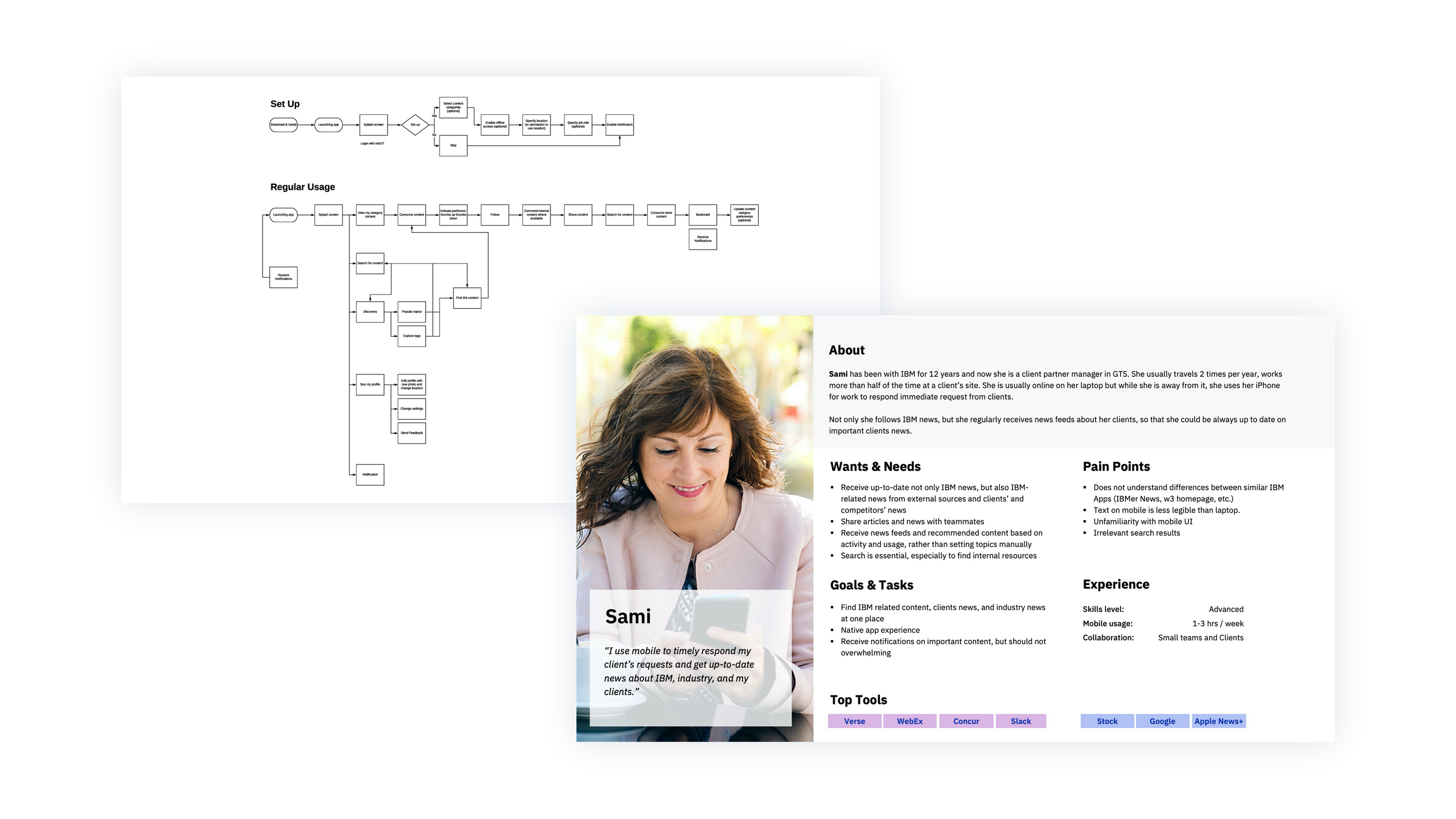
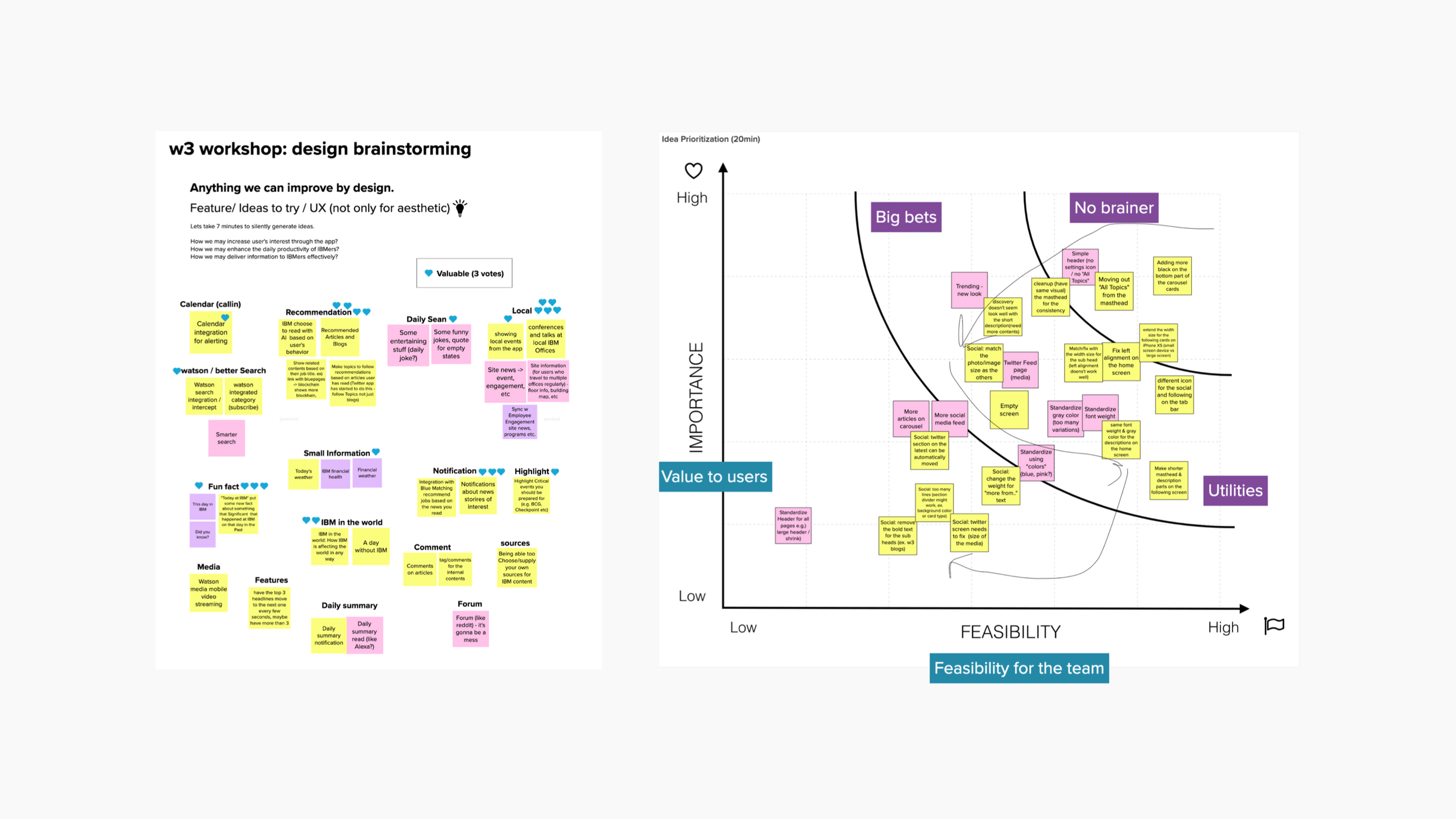
I started with a discovery session workshop with the team and the stakeholders. The workshop object for the project was to define current pain points and align on a shared vision. Then I created persona, rough user journey map and defined action items and outcomes.
Research & Brainstorming
Usability Testing
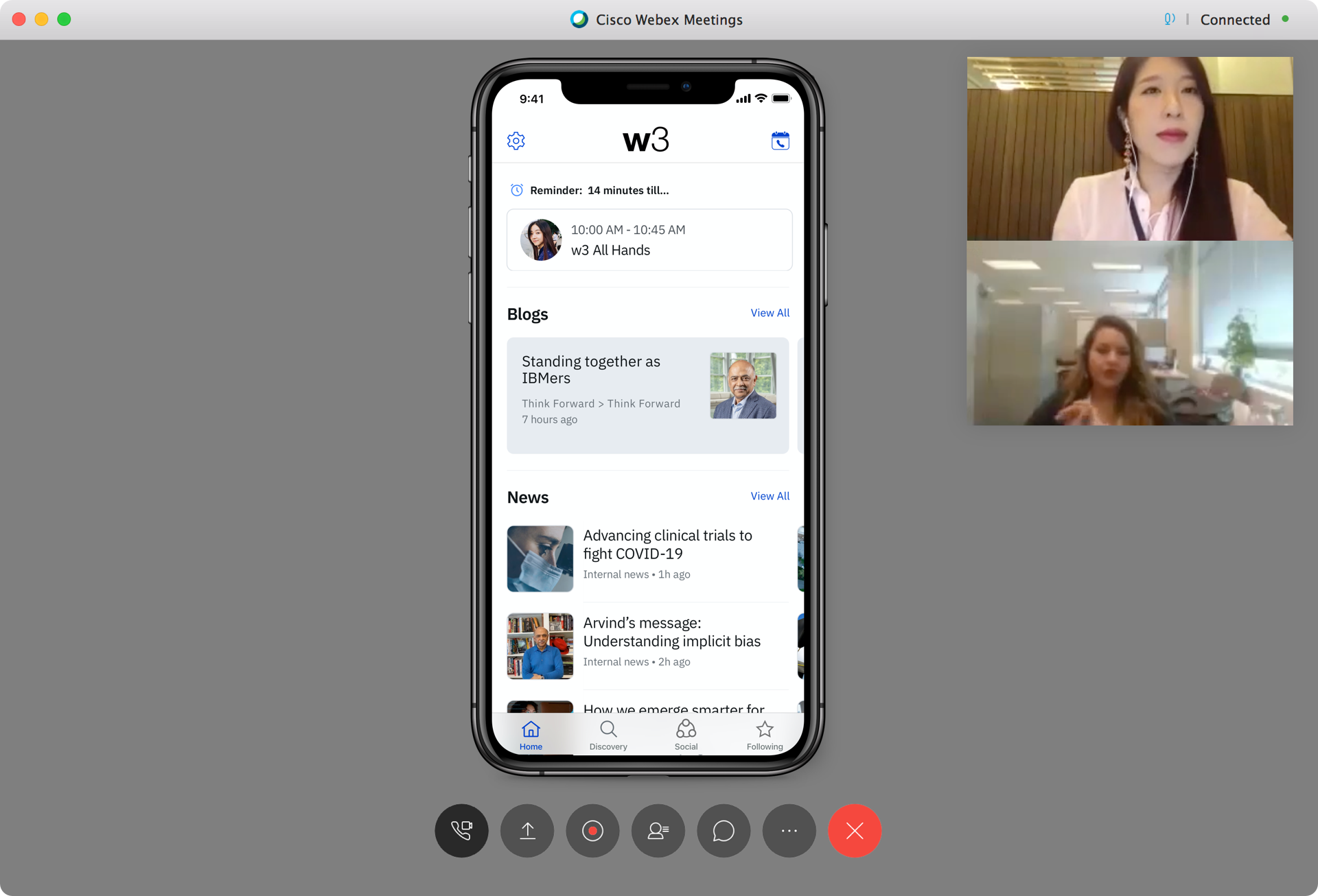
Virtual Usability Testing on WebEx
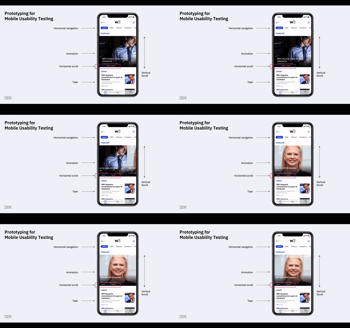
Since we are introducing a new app that did not exist in the IBM internal ecosystem previously, it is critical to deliver user value with a familiar, yet modern and innovative interface. It is also important to receive early feedback from users by conducting frequent usability testing. Early feedback from users was critical for identifying and prioritizing user needs and was gathered by conducting frequent usability testing and surveys.I conducted multiple usability testings with participants who were recruited from an internal UX Volunteer Participants List and from different countries.
Usability testing is not only for receiving feedback that participants think aloud, but also for observing user interaction with devices and for receiving non-verbal feedback. Unlike large screen computers, mobile devices have touch screens, supporting direct interaction with users’ fingers allowing various interactions.
High fidelity prototyping can help to narrow the experience gap between design and live apps and therefore help to find potential usability issues that are possibly happen on live apps. Therefore how accurate and how close to the live app the testing prototype is unquestionably affects user interaction and their feedback.
Low Fidelity
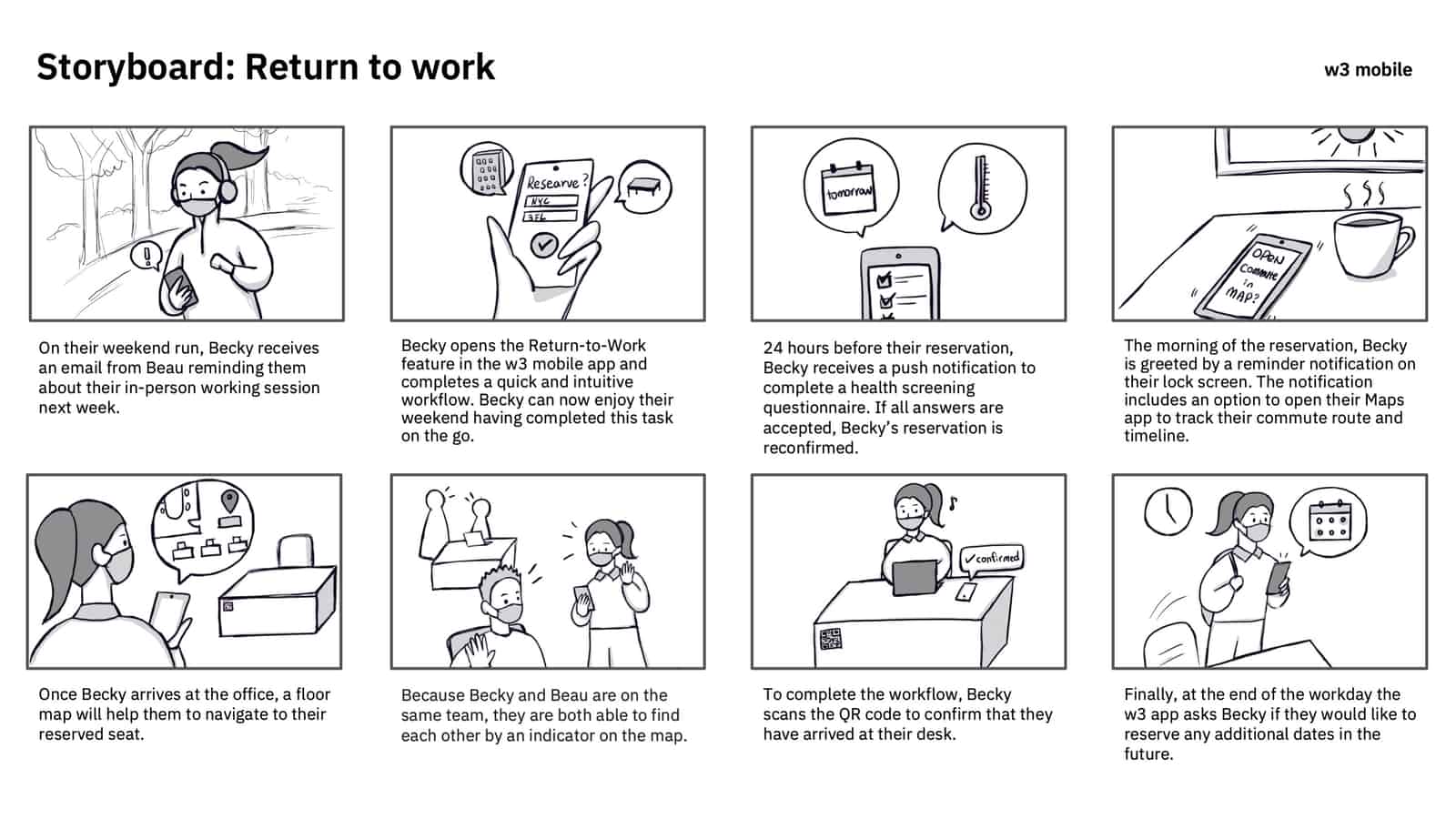
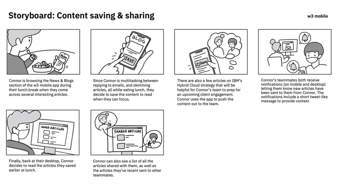
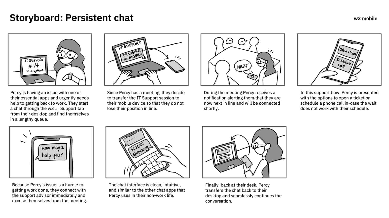
Based on the metrics and the data, I created wireframes and low fidelity mockups. To deliver the abstract ideas to the team and stakeholders, I turned it into provocative and persuasive high-fidelity prototypes for better understanding and communication.
Storyboards
Wireframe
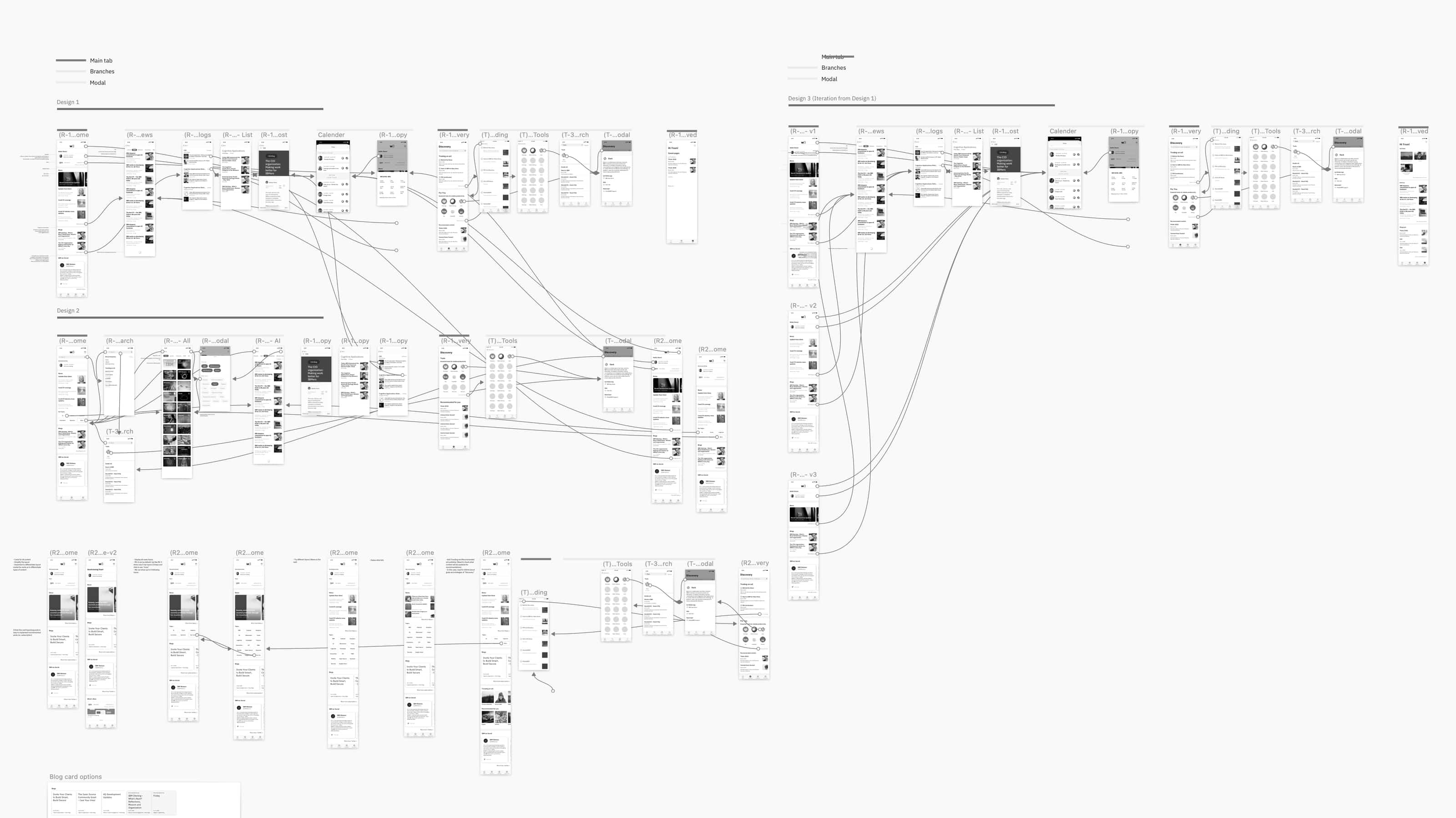
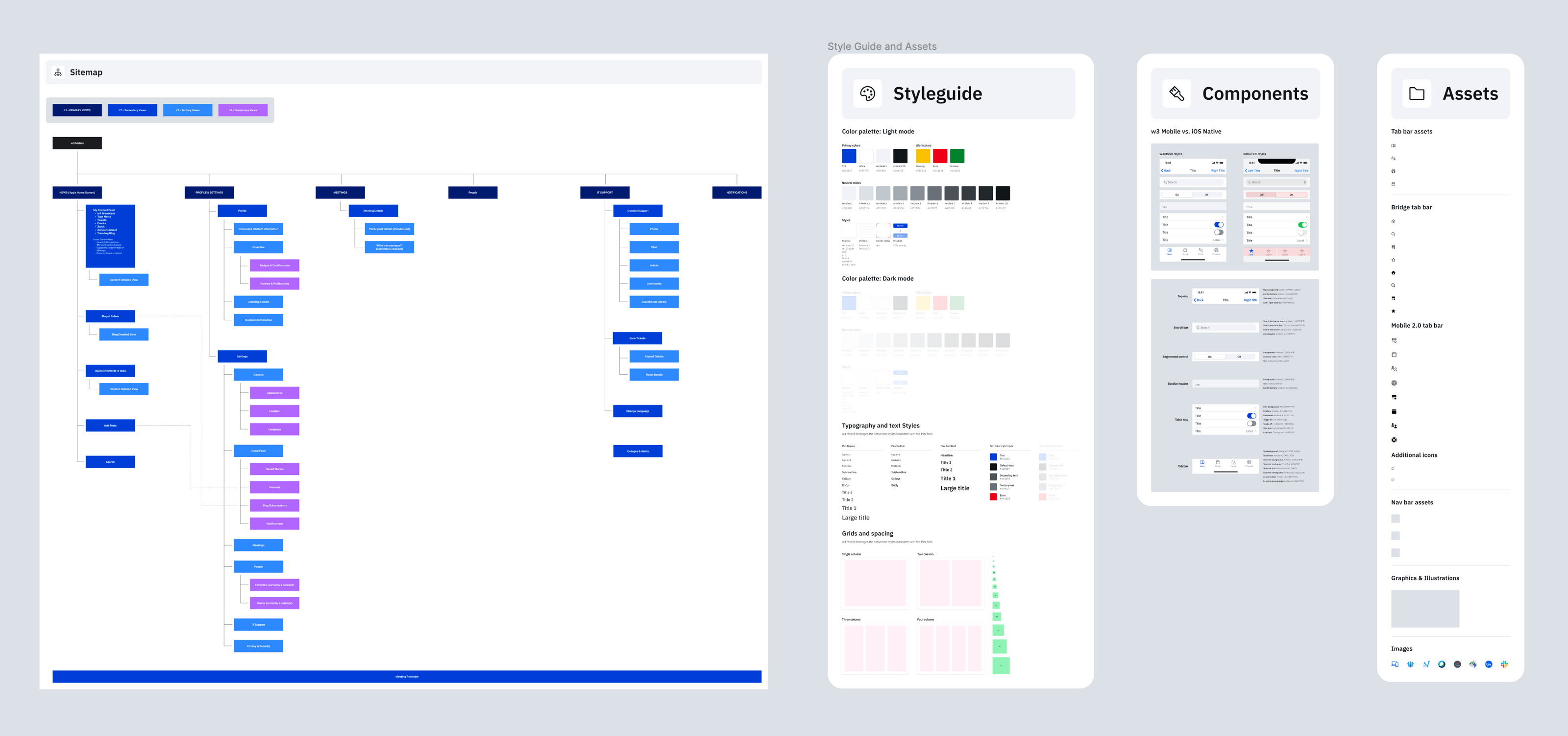
Site Map & Style Guide
Visual Design Execution
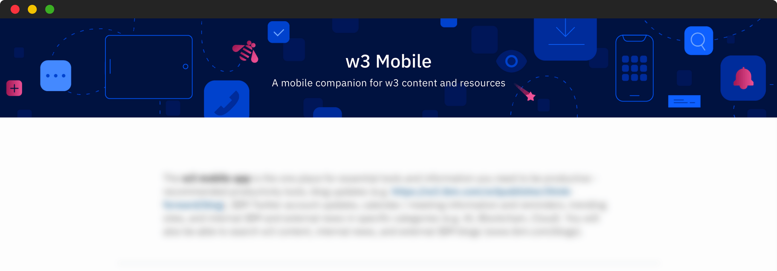
I designed all the illustrations for our app, including the animated graphics on the onboarding screens, empty state graphics, and hero images for the w3 mobile publisher site. I wanted to make the illustrations a visual trigger that quickly communicates the necessary message and provides effective support to the copy applied. The illustrations gave us a chance to create a memorable & unique style and aesthetic for our users.
Illustrations


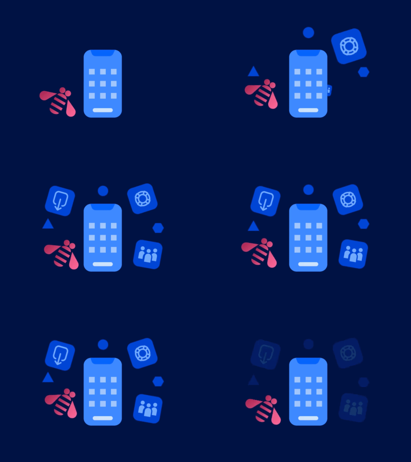


Animations for Onboarding Screens
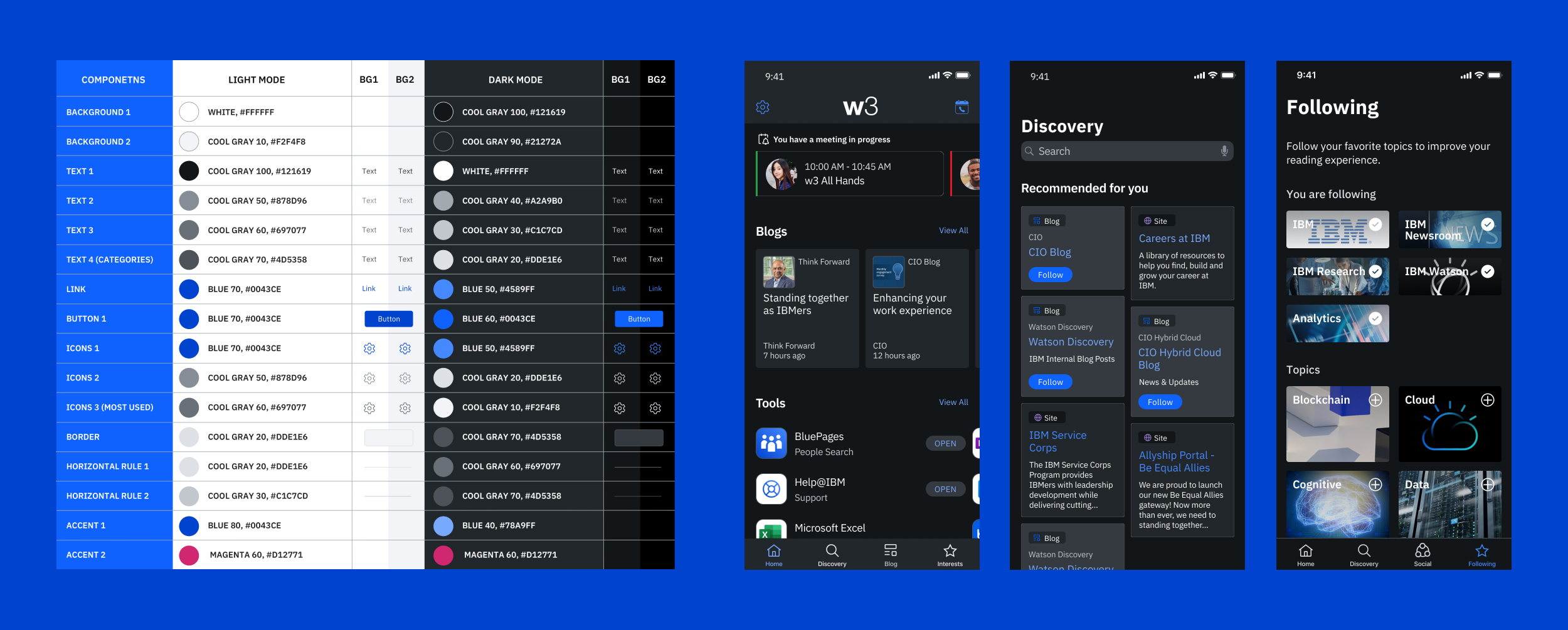
Based on usability testing, I recognized a high demand from the users to have dark mode because they found it to be easier on their eyes. I created a color palette that didn’t exist before within internal projects, and I tested the color contrast ratios for readability. I received great feedback about my dark mode designs from many cross-functional w3 project teams, including a desire to implement it in their products. I created the color palette template and distributed it to the w3 project teams.
Dark Mode
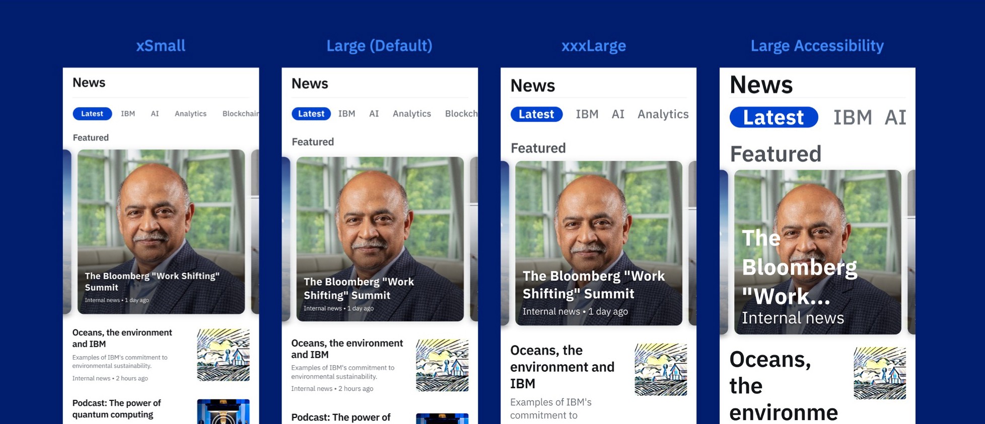
Dynamic Type Sizes
Dynamic Type sizes were also essential for our app because they allow users to choose their preferred text size. I applied Apple’s latest Human Interface Guidelines for the dynamic and larger accessibility type sizes to our app. This was all done prior to Carbon for iOS being available.
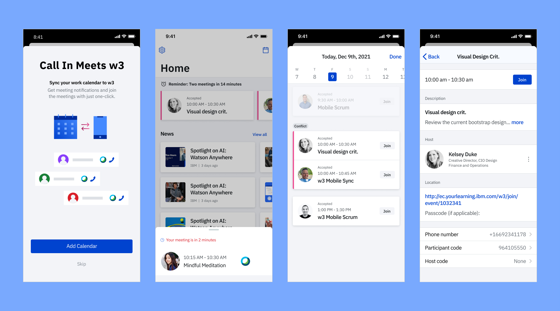
Key Screens
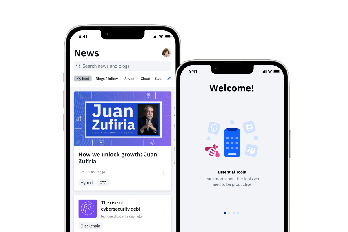
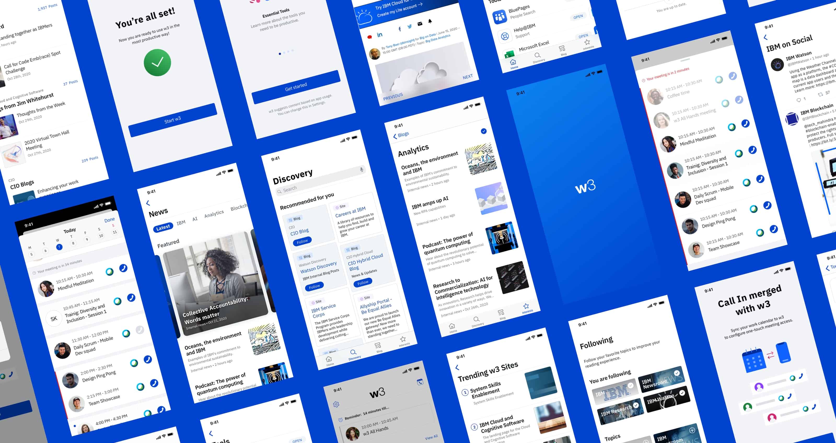
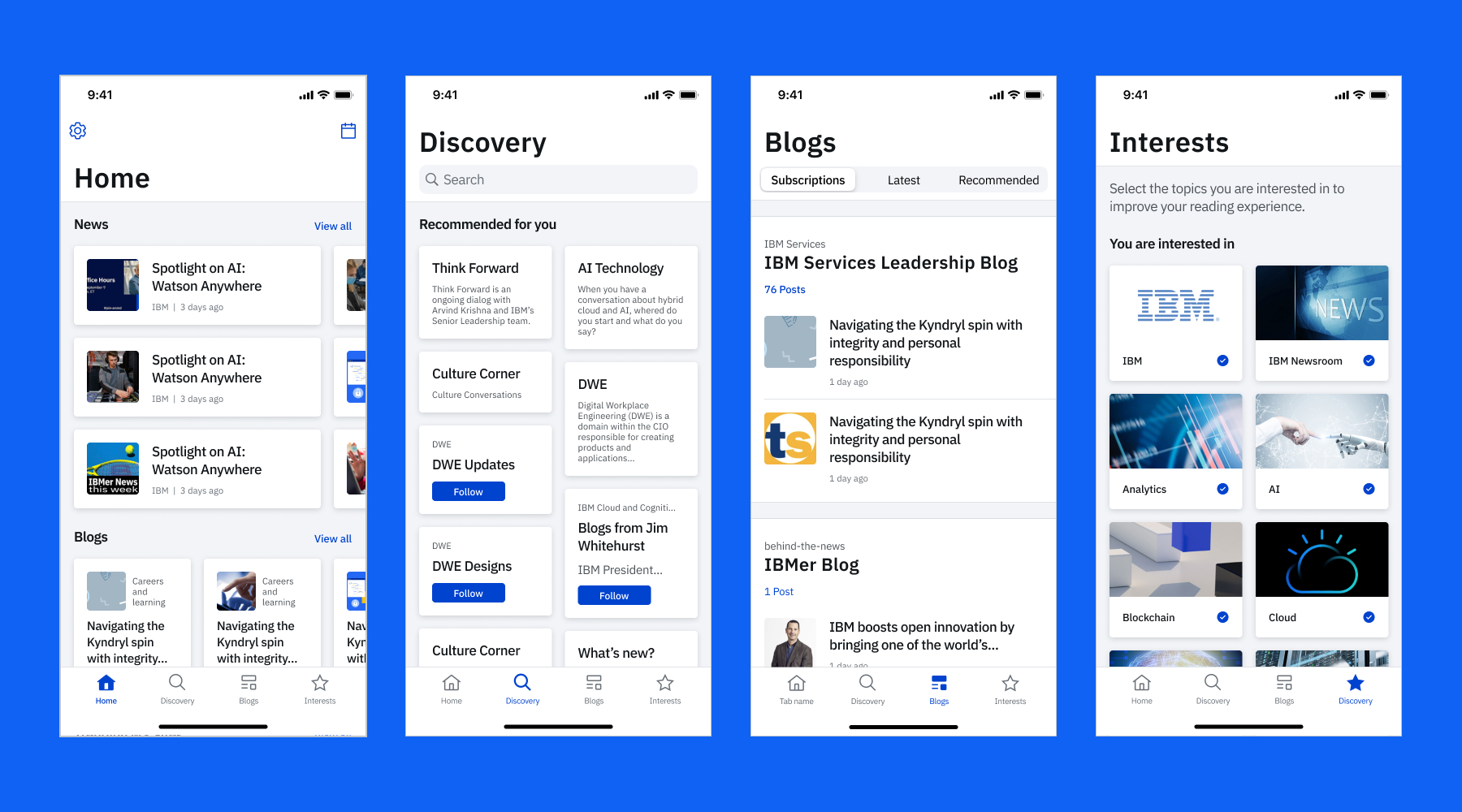
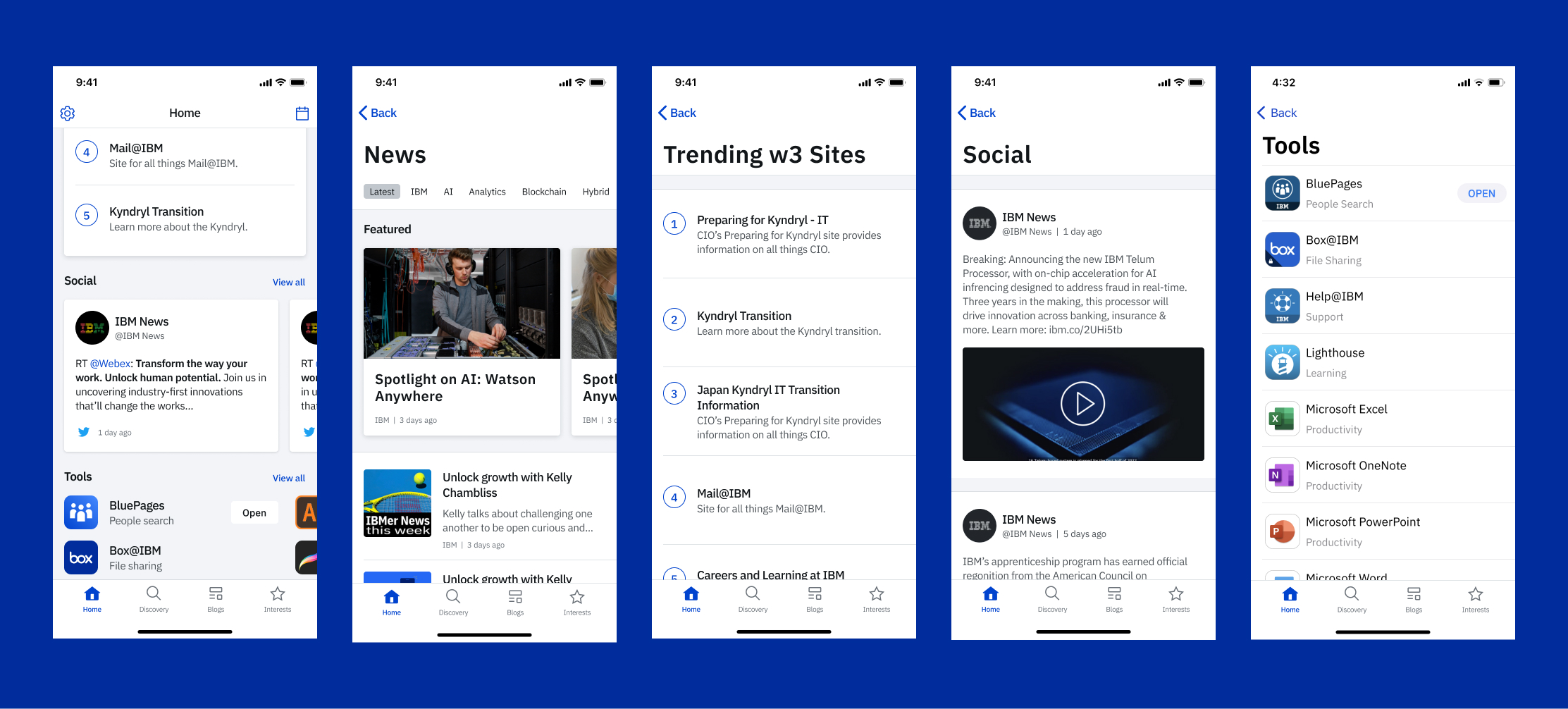
I Ensured the app meets real end user needs and presenting the key solutions.• Essential tools to be productive• Latest posts and blog subscription in one place• Easy contents discovery with recommendation based on usage• Able to join a meeting with one click with calendar feature
Product Impact and Results
The w3 Mobile MVP was released in September 2020. After releasing the MVP, I conducted a survey with approximately 1,000 IBMers who actively used the MVP and received several pieces of positive feedback.
16
NPS (Net Promoter Score)
77%
Users satisfied or very satisfied with the Calendar integration
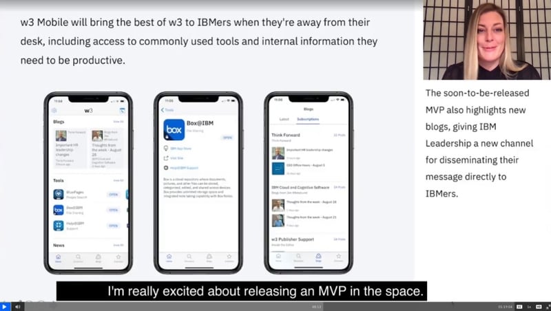
w3 Mobile was shared by Jill Fourie, VP of Digital Workplace Engineering at a CIO All Hands which was attended by 12,000 CIO employees.
User's Feedback
“This is useful for people like me that are normally on the road all the time and must get on WebEx with their phone.”“This application is very useful for finding all the necessary information you need for work.”“The best way to manage your calendar.”

w3 Mobile
Creating an application that proactively provides core tools and services for IBMers
MVP Launched on September 2020
Challenges
We wanted to create an application that proactively provides IBMers with the information they need to be effective at their jobs and informed representatives of the company. Since we introduced a new app that did not exist in the IBM internal ecosystem previously, it was critical to delivering user value with a familiar yet modern and innovative interface. From a visual standpoint, we had no existing design system, so I needed to design most elements from scratch, including certain iconography and graphics. It was also challenging to implement the IBM Plex font on the first native apps.
My Role: Lead Designer
I led a team of UX designers, visual designers and researchers, and oversaw project scope, design direction, delivery, as well as team satisfaction while working on the project. Additionally, I brought my mobile design expertise to the team and educated them by conducting design workshops. I worked with the CIO’s multidisciplinary teams and ensured w3 Mobile was consistent with other w3 experiences.
Process
I was involved in every stage of the design process, including competitive evaluation and preliminary research to understand our target users and to create the initial personas.

Discovery Session
I started with a discovery session workshop with the team and the stakeholders. The workshop object for the project was to define current pain points and align on a shared vision. Then I created persona, rough user journey map and defined action items and outcomes.

Research & Brainstorming


Usability Testing
Since we are introducing a new app that did not exist in the IBM internal ecosystem previously, it is critical to deliver user value with a familiar, yet modern and innovative interface. It is also important to receive early feedback from users by conducting frequent usability testing. Early feedback from users was critical for identifying and prioritizing user needs and was gathered by conducting frequent usability testing and surveys.I conducted multiple usability testings with participants who were recruited from an internal UX Volunteer Participants List and from different countries.
Usability testing is not only for receiving feedback that participants think aloud, but also for observing user interaction with devices and for receiving non-verbal feedback. Unlike large screen computers, mobile devices have touch screens, supporting direct interaction with users’ fingers allowing various interactions.

Virtual Usability Testing on WebEx
High fidelity prototyping can help to narrow the experience gap between design and live apps and therefore help to find potential usability issues that are possibly happen on live apps. Therefore how accurate and how close to the live app the testing prototype is unquestionably affects user interaction and their feedback.
Low Fidelity
Based on the metrics and the data, I created wireframes and low fidelity mockups. To deliver the abstract ideas to the team and stakeholders, I turned it into provocative and persuasive high-fidelity prototypes for better understanding and communication.
Storyboards


Wireframe

Site Map & Style Guide


Visual Design Execution
I designed all the illustrations for our app, including the animated graphics on the onboarding screens, empty state graphics, and hero images for the w3 mobile publisher site. I wanted to make the illustrations a visual trigger that quickly communicates the necessary message and provides effective support to the copy applied. The illustrations gave us a chance to create a memorable & unique style and aesthetic for our users.
Illustrations


Animations for Onboarding Screens
Based on usability testing, I recognized a high demand from the users to have dark mode because they found it to be easier on their eyes. I created a color palette that didn’t exist before within internal projects, and I tested the color contrast ratios for readability. I received great feedback about my dark mode designs from many cross-functional w3 project teams, including a desire to implement it in their products. I created the color palette template and distributed it to the w3 project teams.
Dark Mode

Dynamic Type Sizes
Dynamic Type sizes were also essential for our app because they allow users to choose their preferred text size. I applied Apple’s latest Human Interface Guidelines for the dynamic and larger accessibility type sizes to our app. This was all done prior to Carbon for iOS being available.

Key Screens
I Ensured the app meets real end user needs and presenting the key solutions.• Essential tools to be productive• Latest posts and blog subscription in one place• Easy contents discovery with recommendation based on usage• Able to join a meeting with one click with calendar feature


Product Impact and Results
The w3 Mobile MVP was released in September 2020. After releasing the MVP, I conducted a survey with approximately 1,000 IBMers who actively used the MVP and received several pieces of positive feedback.
16
NPS (Net Promoter Score)
77%
Users satisfied or very satisfied with the Calendar integration

w3 Mobile was shared by Jill Fourie, VP of Digital Workplace Engineering at a CIO All Hands which was attended by 12,000 CIO employees.
User's Feedback
“This is useful for people like me that are normally on the road all the time and must get on WebEx with their phone.”“This application is very useful for finding all the necessary information you need for work.”“The best way to manage your calendar.”

w3 Mobile
Creating an application that proactively provides core tools and services for IBMers
MVP Launched on September 2020
Challenges
We wanted to create an application that proactively provides IBMers with the information they need to be effective at their jobs and informed representatives of the company. Since we introduced a new app that did not exist in the IBM internal ecosystem previously, it was critical to delivering user value with a familiar yet modern and innovative interface. From a visual standpoint, we had no existing design system, so I needed to design most elements from scratch, including certain iconography and graphics. It was also challenging to implement the IBM Plex font on the first native apps.
My Role: Lead Designer
I led a team of UX designers, visual designers and researchers, and oversaw project scope, design direction, delivery, as well as team satisfaction while working on the project. Additionally, I brought my mobile design expertise to the team and educated them by conducting design workshops. I worked with the CIO’s multidisciplinary teams and ensured w3 Mobile was consistent with other w3 experiences.
Process
I was involved in every stage of the design process, including competitive evaluation and preliminary research to understand our target users and to create the initial personas.

Discovery Session
I started with a discovery session workshop with the team and the stakeholders. The workshop object for the project was to define current pain points and align on a shared vision. Then I created persona, rough user journey map and defined action items and outcomes.

Research & Brainstorming


Usability Testing
Since we are introducing a new app that did not exist in the IBM internal ecosystem previously, it is critical to deliver user value with a familiar, yet modern and innovative interface. It is also important to receive early feedback from users by conducting frequent usability testing. Early feedback from users was critical for identifying and prioritizing user needs and was gathered by conducting frequent usability testing and surveys.I conducted multiple usability testings with participants who were recruited from an internal UX Volunteer Participants List and from different countries.

Virtual Usability Testing on WebEx
Usability testing is not only for receiving feedback that participants think aloud, but also for observing user interaction with devices and for receiving non-verbal feedback. Unlike large screen computers, mobile devices have touch screens, supporting direct interaction with users’ fingers allowing various interactions.
High fidelity prototyping can help to narrow the experience gap between design and live apps and therefore help to find potential usability issues that are possibly happen on live apps. Therefore how accurate and how close to the live app the testing prototype is unquestionably affects user interaction and their feedback.
Low Fidelity
Based on the metrics and the data, I created wireframes and low fidelity mockups. To deliver the abstract ideas to the team and stakeholders, I turned it into provocative and persuasive high-fidelity prototypes for better understanding and communication.
Storyboards


Wireframe

Site Map & Style Guide


Visual Design Execution
Illustrations
I designed all the illustrations for our app, including the animated graphics on the onboarding screens, empty state graphics, and hero images for the w3 mobile publisher site. I wanted to make the illustrations a visual trigger that quickly communicates the necessary message and provides effective support to the copy applied. The illustrations gave us a chance to create a memorable & unique style and aesthetic for our users.


Animations for Onboarding Screens


Dark Mode
Based on usability testing, I recognized a high demand from the users to have dark mode because they found it to be easier on their eyes. I created a color palette that didn’t exist before within internal projects, and I tested the color contrast ratios for readability. I received great feedback about my dark mode designs from many cross-functional w3 project teams, including a desire to implement it in their products. I created the color palette template and distributed it to the w3 project teams.

Dynamic Type Sizes
Dynamic Type sizes were also essential for our app because they allow users to choose their preferred text size. I applied Apple’s latest Human Interface Guidelines for the dynamic and larger accessibility type sizes to our app. This was all done prior to Carbon for iOS being available.

Key Screens
I Ensured the app meets real end user needs and presenting the key solutions.• Essential tools to be productive• Latest posts and blog subscription in one place• Easy contents discovery with recommendation based on usage• Able to join a meeting with one click with calendar feature


Product Impact and Results
The w3 Mobile MVP was released in September 2020. After releasing the MVP, I conducted a survey with approximately 1,000 IBMers who actively used the MVP and received several pieces of positive feedback.
16
NPS (Net Promoter Score)
77%
Users satisfied or very satisfied with the Calendar integration

w3 Mobile was shared by Jill Fourie, VP of Digital Workplace Engineering at a CIO All Hands which was attended by 12,000 CIO employees.
User's Feedback
“This is useful for people like me that are normally on the road all the time and must get on WebEx with their phone.”“This application is very useful for finding all the necessary information you need for work.”“The best way to manage your calendar.”

