

MBR App
Creating an application that proactively provides actionable business insights and decision-making tools for Cisco leaders.
2025
Challenges
We set out to design an executive-facing application that transforms complex business data into clear, actionable insights. The goal was to enable Cisco’s senior leadership to make faster and more informed decisions by connecting AI-powered analytics, sales performance metrics, and financial reports into one cohesive experience.
One of the biggest challenges was simplifying a deeply technical system used across multiple business units while maintaining data accuracy and trust. The application needed to balance intelligence with usability—surfacing what mattered most without overwhelming the user. In addition, we were building for a wide range of roles, from regional leaders to executive vice presidents, which required flexible interaction patterns and scalable information architecture.
My Role: Lead Designer
As Lead Designer, I guided the end-to-end design vision for the MBR App, from strategy and research to delivery. I partnered closely with product managers, and engineers to translate business intelligence into intuitive visual experiences.
I led design explorations around navigation, filtering, and AI insight presentation, ensuring that every interaction supported quick comprehension and confident decision-making. I also helped define the visual direction and component consistency across web and mobile, aligning our design approach with Cisco’s evolving enterprise ecosystem.
Beyond design execution, I drove collaboration and alignment across stakeholder groups, helping leadership visualize the product’s potential through prototypes, storytelling, and strategic design reviews.
Intro - From Complexity to Simplicity
MBR – My Business Reports
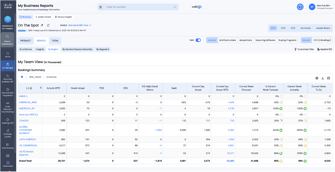
My Business Reports (MBR) is an access-controlled, finance reporting tool and Cisco’s main source for legal bookings. Sellers use MBR to analyze data, track bookings and goals to hit targets.
While powerful for performance management, its web-based design can feel complex and data-heavy, making mobile a key opportunity to simplify and improve the experience.
What it is
The MBR App (My Business Reports App) is a mobile application designed to give sellers, leaders, and executives trusted access to Cisco’s official bookings information
— Your trusted source of bookings information. Access data on the go
Who uses it
6,000–7,000 active users, used heavily by sellers, financial leaders, and executives
— with high visibility across the business.
When it started
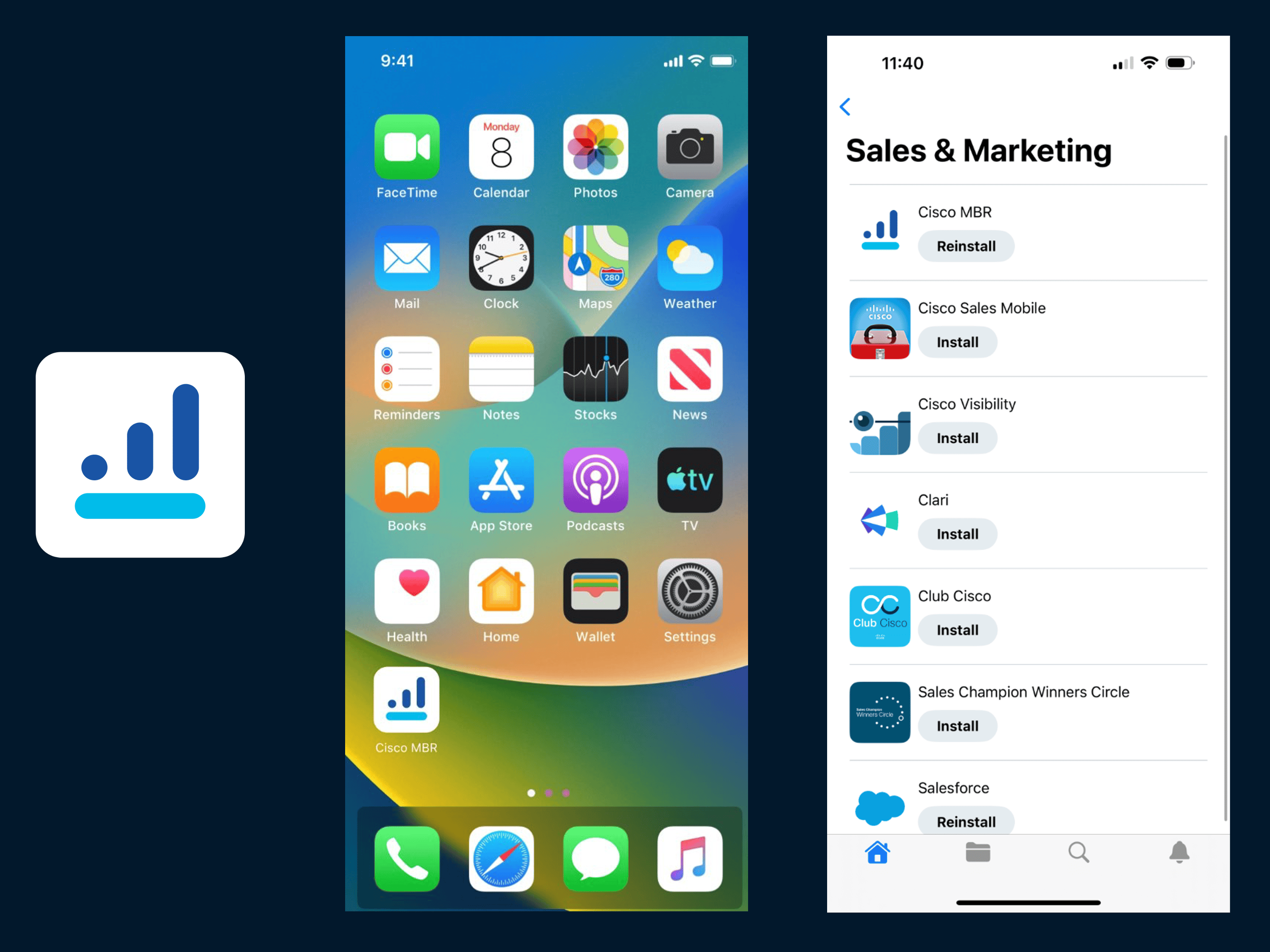
First launched in 2016, with a strong focus on iOS and less attention on Android.
MBR App Original Design
The original version of the MBR App offered valuable insights and tools, but the experience felt dense and difficult to navigate. Many useful features were hidden behind layers of menus, making it hard for users to find and act on key information.
Initial Process
Initial Timeline
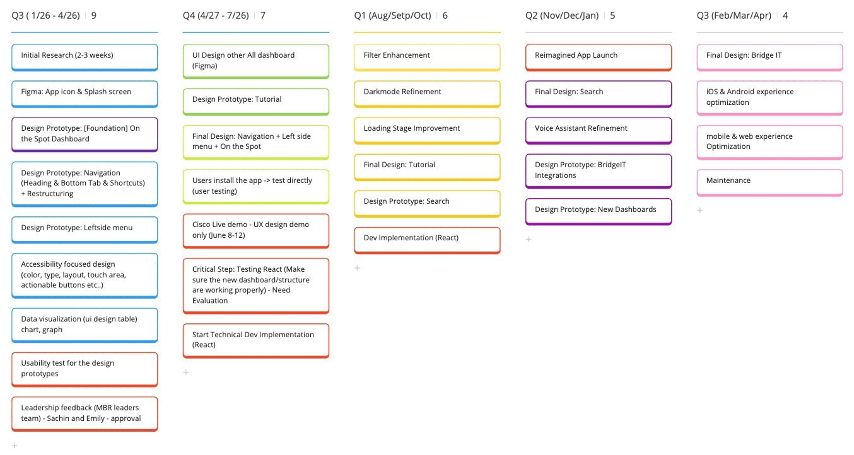
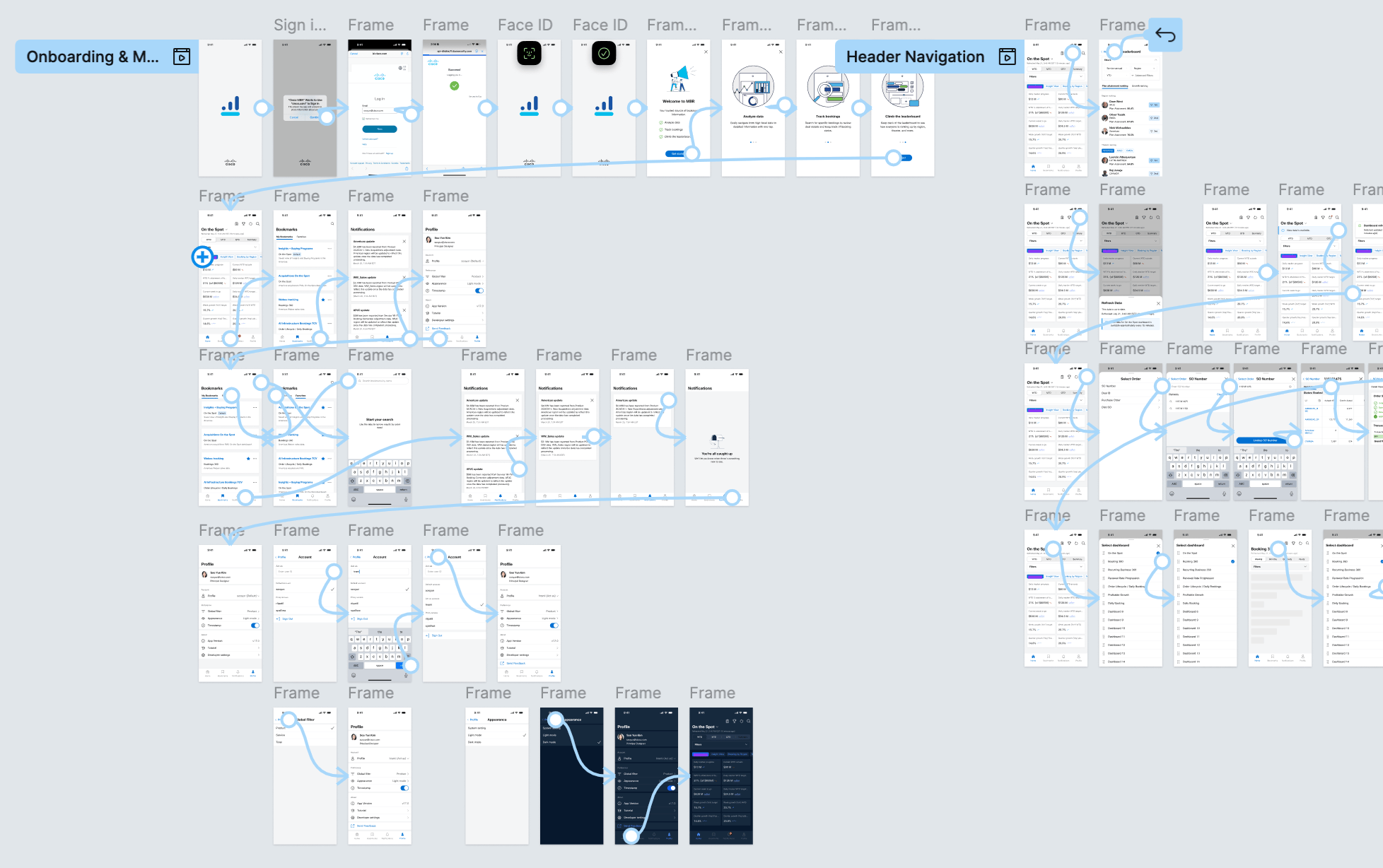
I created the initial project timeline starting with the On-the-Spot Dashboard in Q3–Q4 as the core foundation. This was followed by navigation updates, prototyping, usability testing, development work, and the introduction of new features.
Technical Discussion
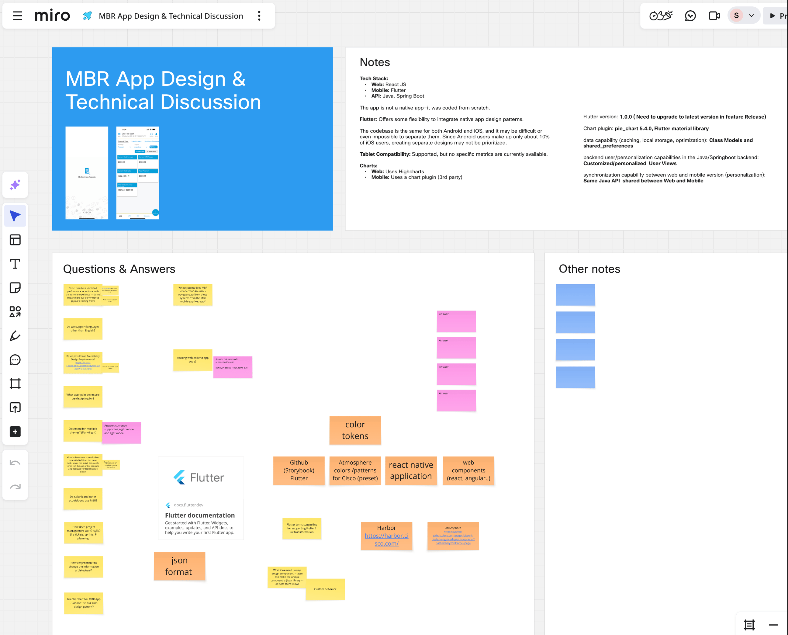
I led technical discussions with the development team and Atmosphere engineering to align on the foundation of the mobile experience. The work included defining the tech stack transition from React to Flutter, planning for dark and light mode accessibility, applying Atmosphere design patterns referenced from the Directory mobile app, and ensuring chart components could flexibly support various colors and layouts.
App Comparison Research
Navigation & Filtering
Redesigned navigation flow with smarter filtering using bottom modals, calendar selectors, and categorized options.
Data Interaction
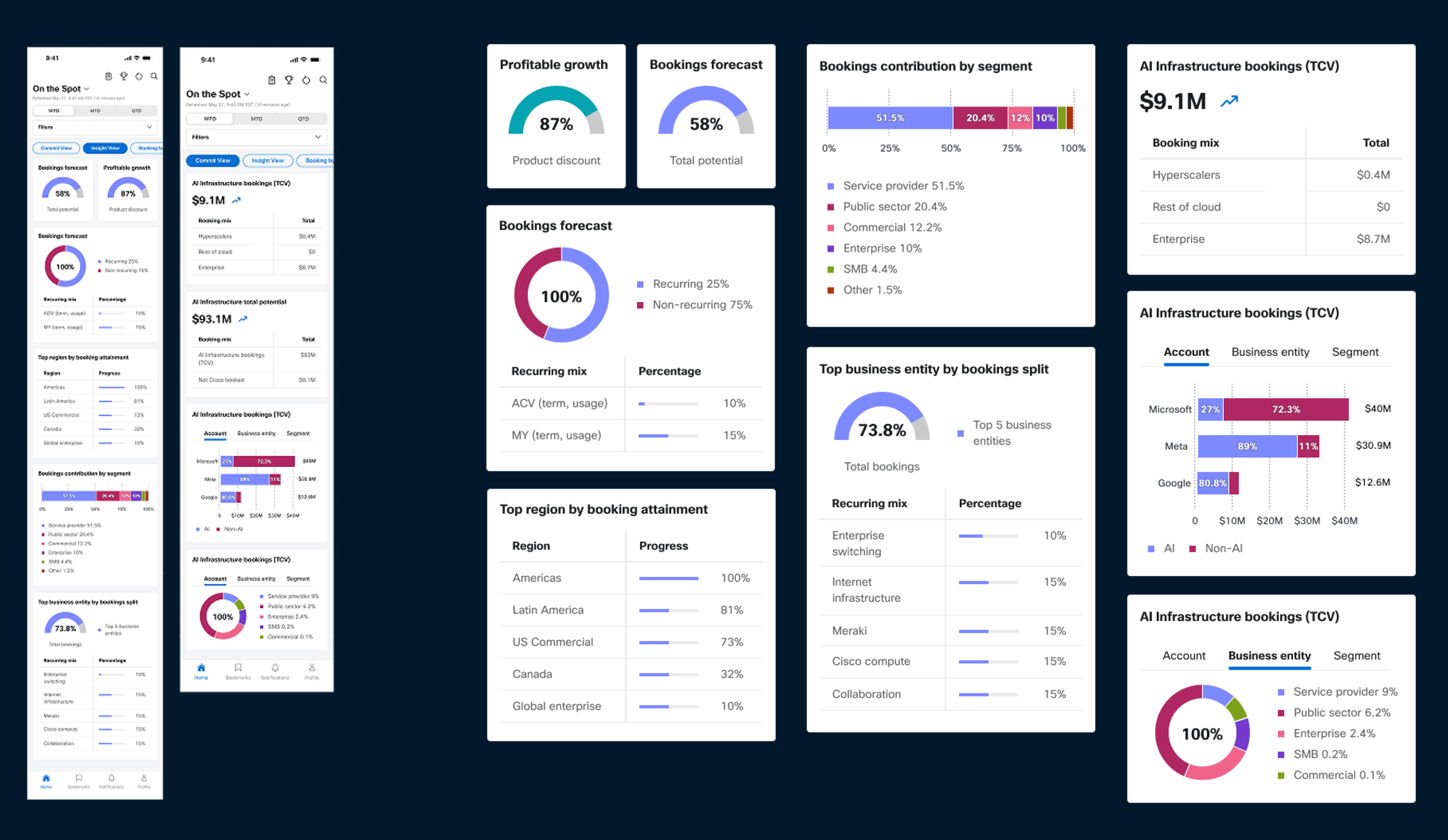
Interactive charts, tap-to-expand details, and clearer hierarchy for easier data exploration.
Dashboard Usability
Save and organize frequently used views for better discoverability and usability.
Onboarding Experience
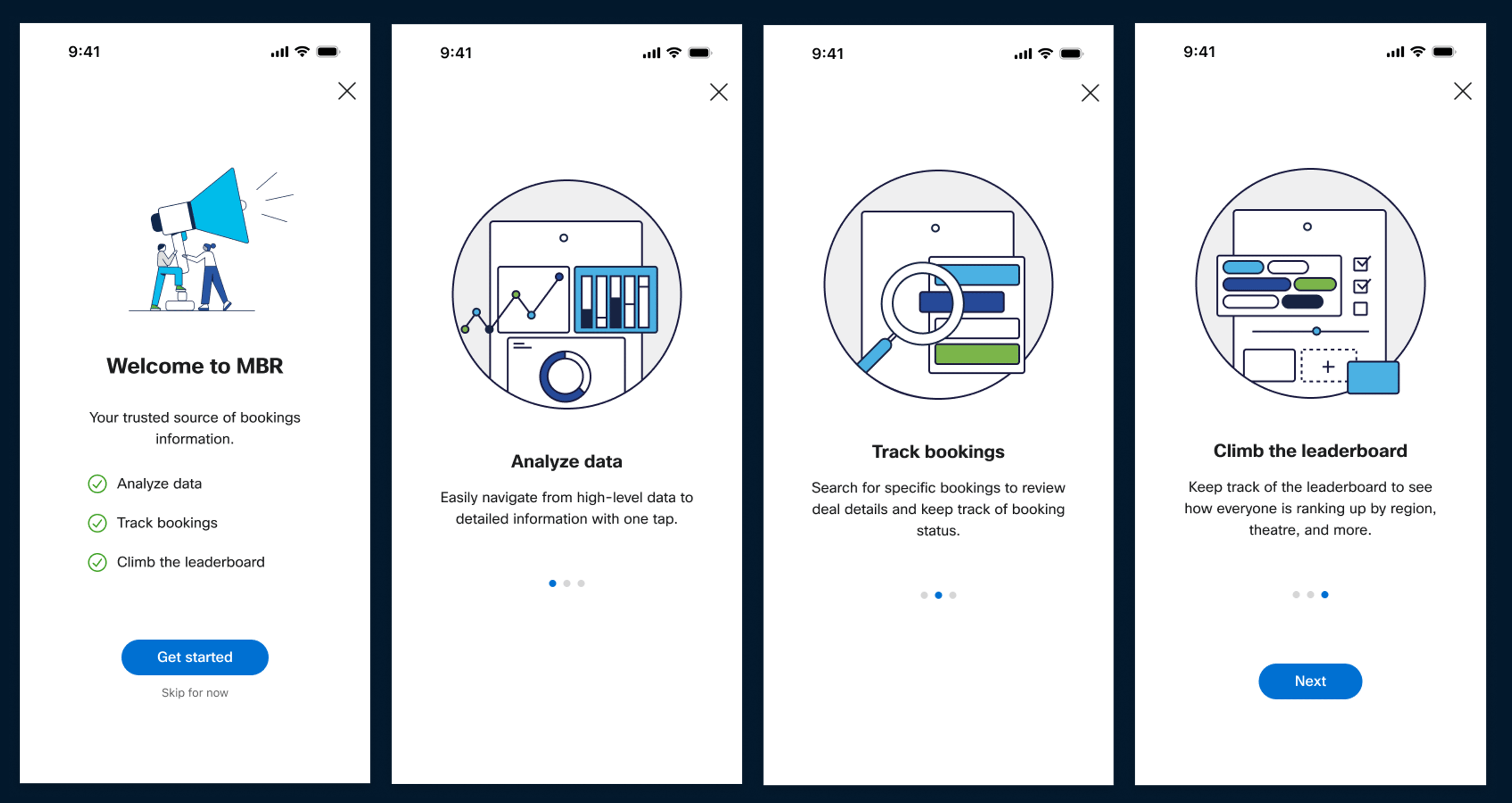
Contextual tooltips and lightweight guidance to help users get started quickly.
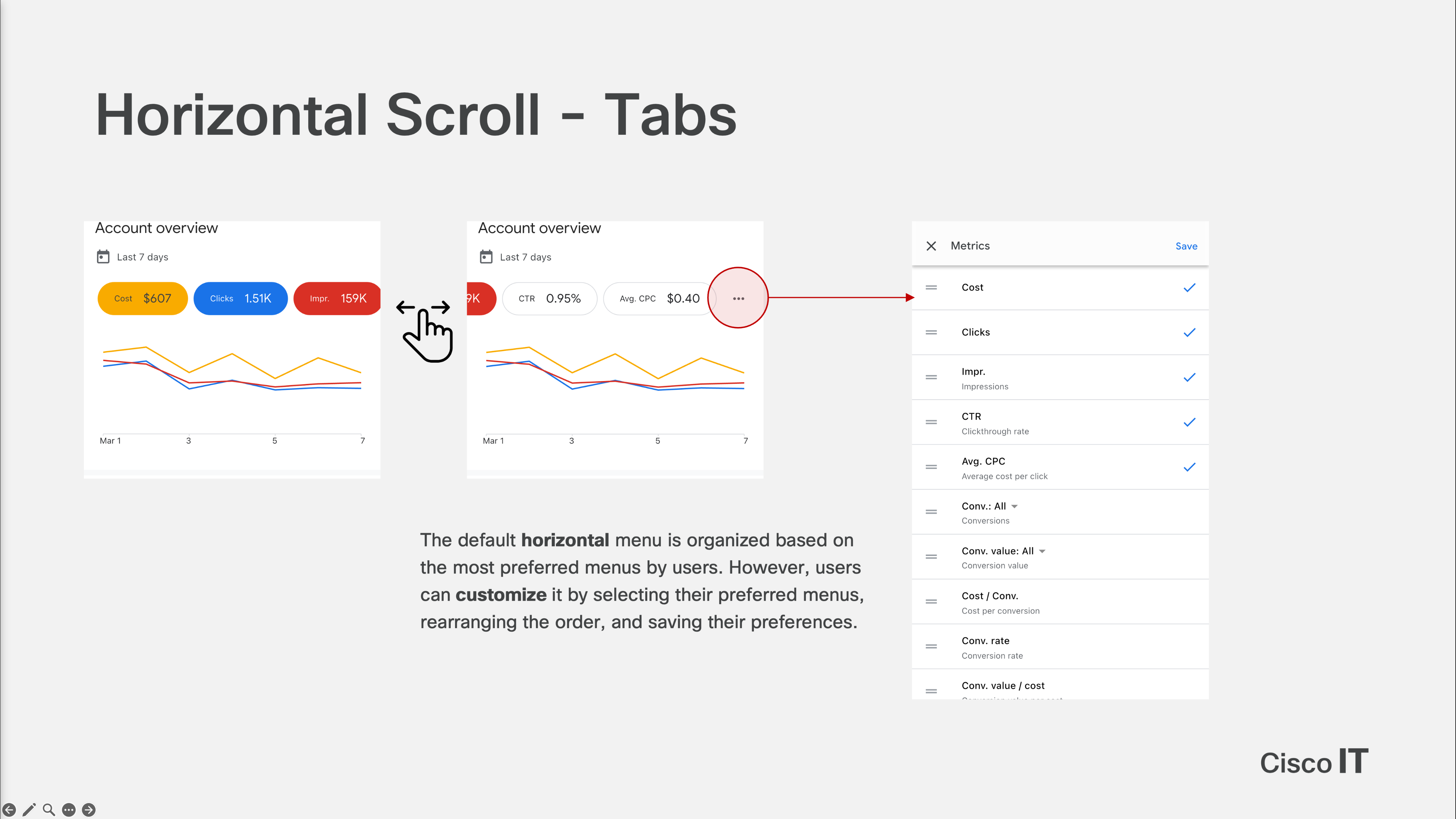
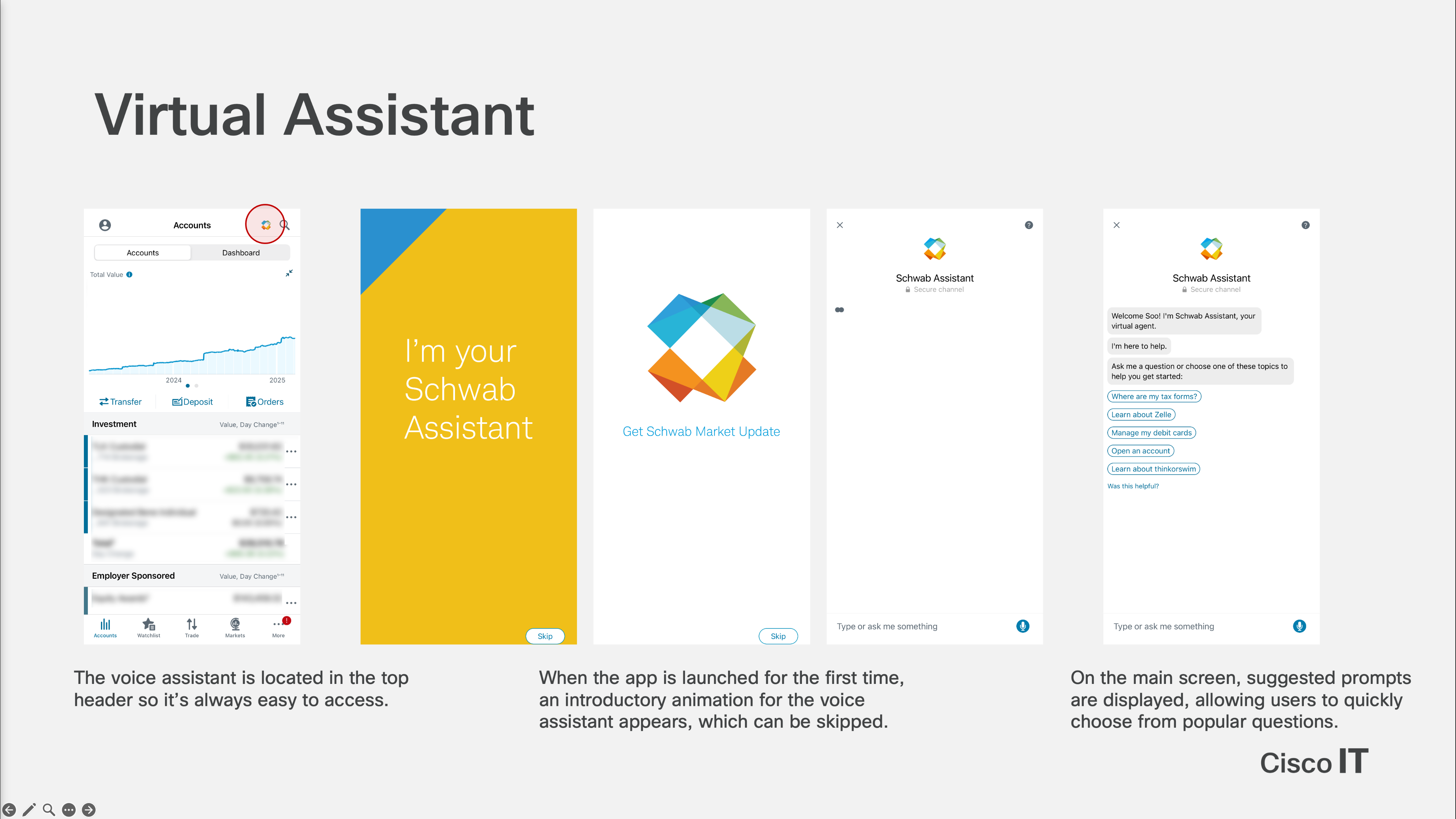
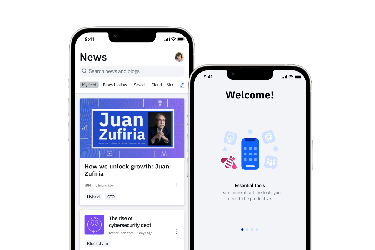
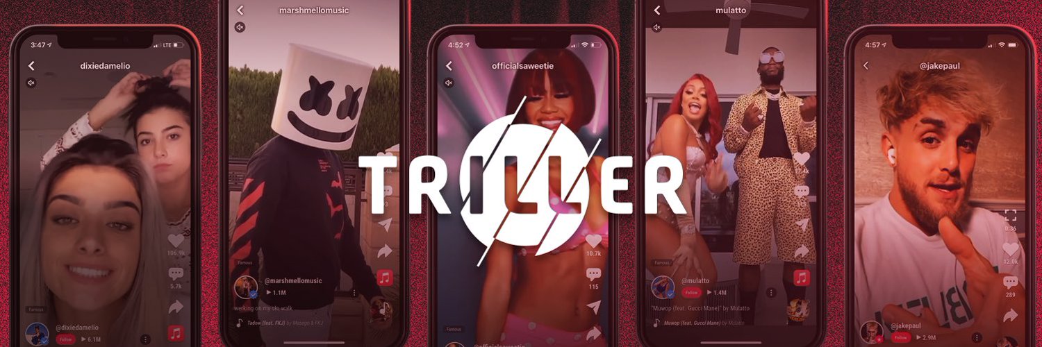
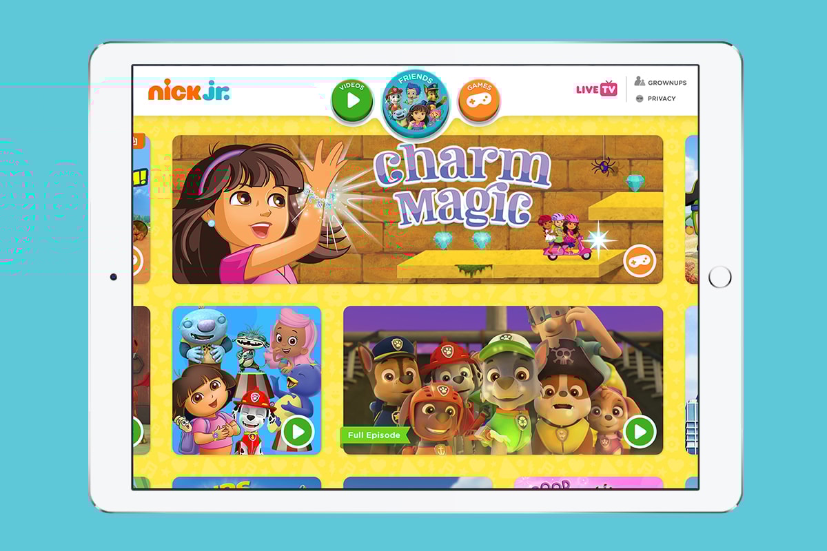
I conducted a comparative analysis of leading enterprise applications to identify best practices in filtering, data visualization, navigation, and onboarding. The research involved heuristic evaluation and UI/UX pattern analysis across four apps: Google Ads, Charles Schwab, Google Analytics, and Salesforce CRM Analytics.
Research
In-depth User Interview
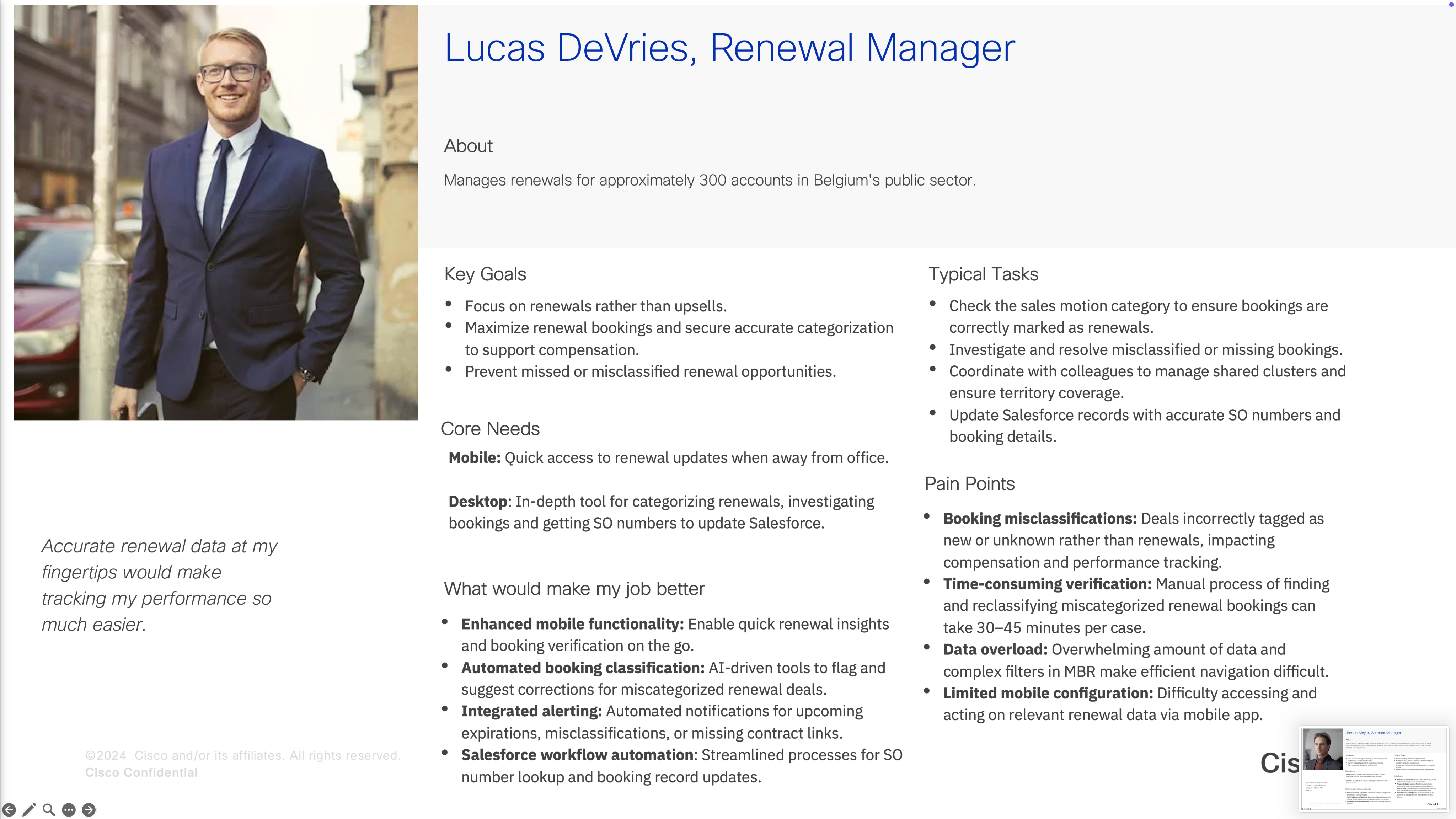
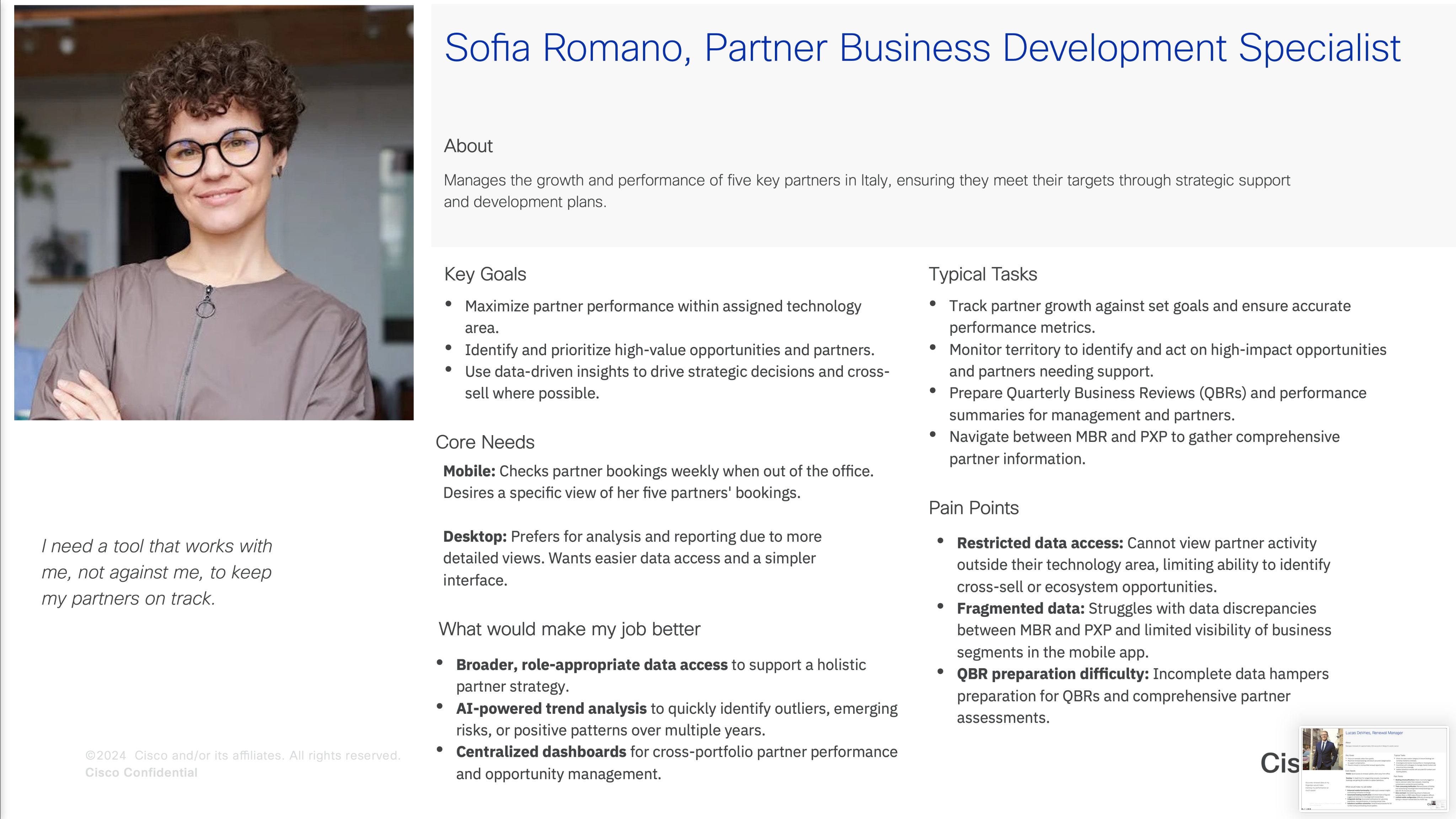
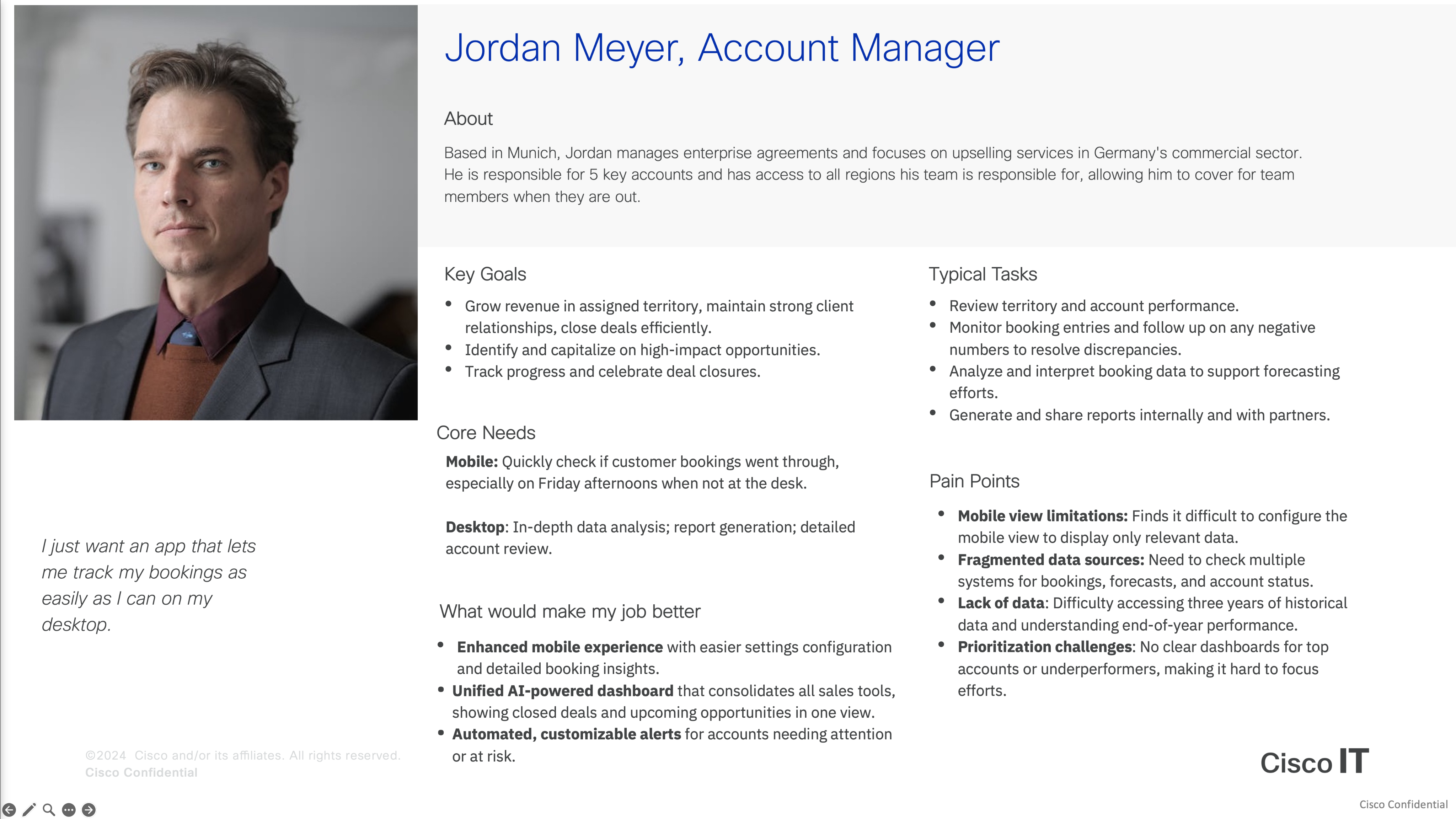
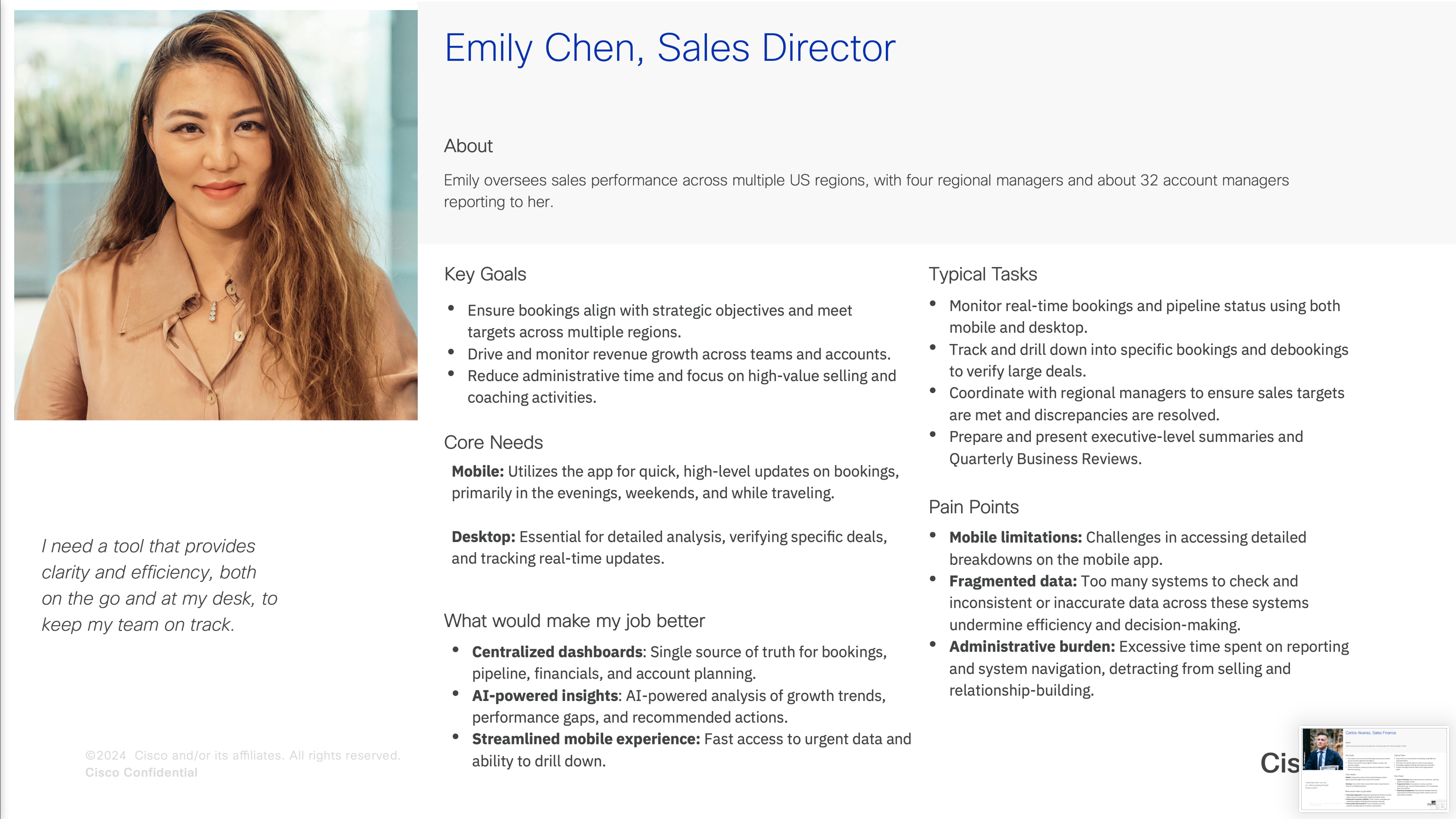
In-depth interviews with nine participants across five roles highlighted the need for more detailed booking information, as the current dashboard only shows high-level totals. Participants also struggled with personalization, repeatedly rebuilding their preferred views. Overall, users valued the app’s capabilities but wanted a more intuitive design with dashboards that better support their core tasks.
Brainstorming Workshop
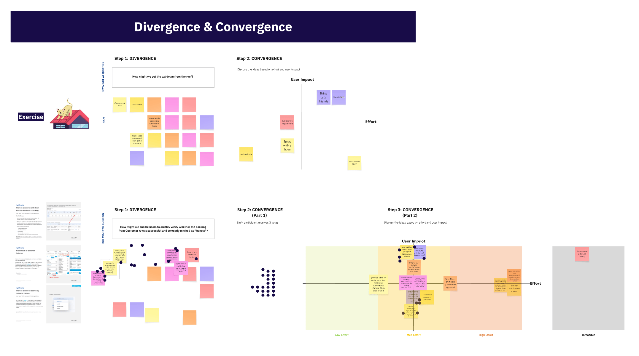
As part of our brainstorming workshop, the team generated a range of ideas to simplify the experience and support key workflows. The highlights included one-tap access to the details table, an always-visible search bar, customizable default dashboard landing, direct filter saving on mobile, a simplified details table, tailored in-app training, and notification subscriptions.
Kano Analysis via Survey
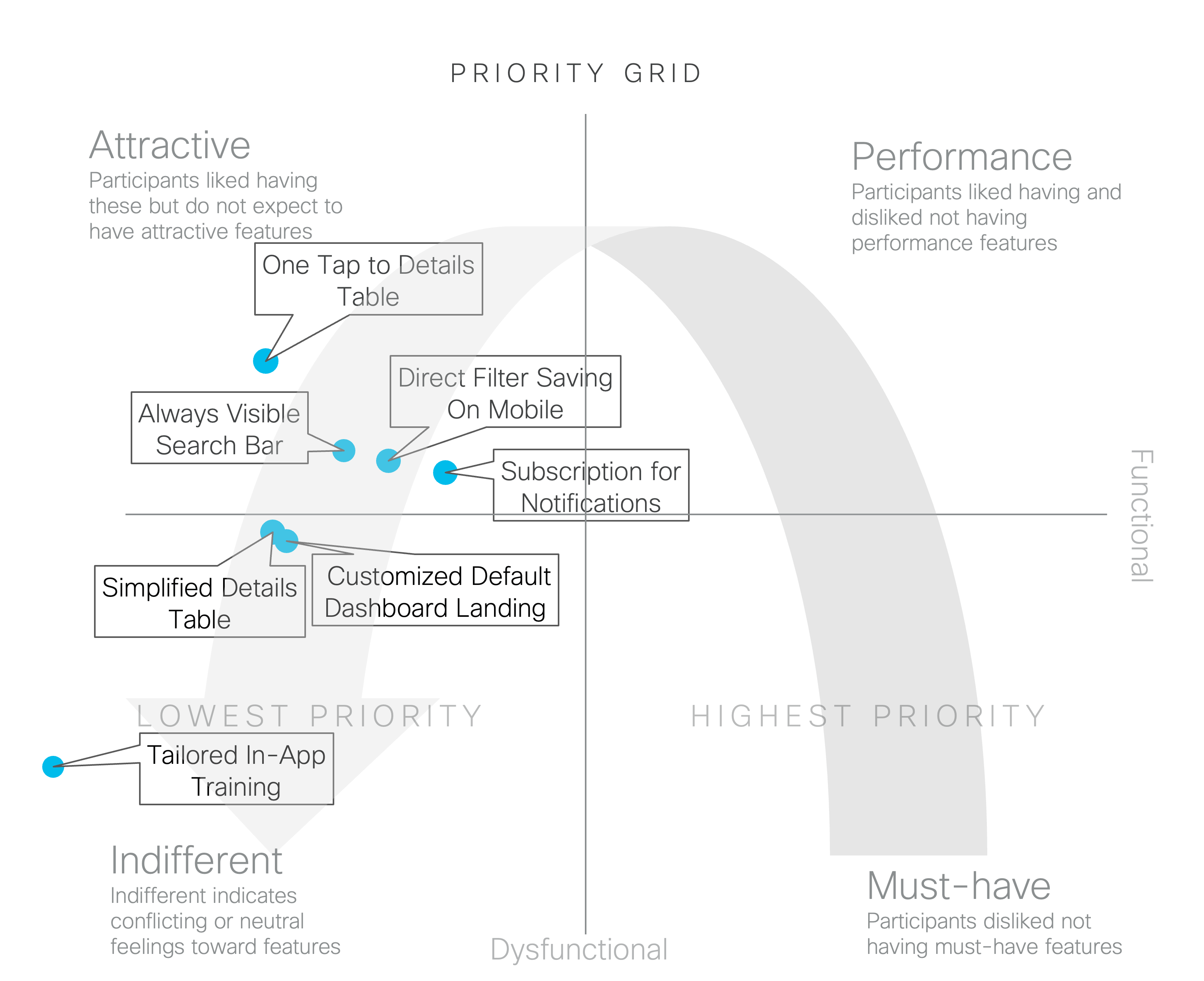
I collaborated with a user researcher to conduct a survey-based Kano analysis and surface key experience opportunities. A simple but meaningful improvement involved allowing users to open the detailed table with a single tap. Higher-effort features, such as mobile notification subscriptions and saving filter preferences, showed strong long-term value. The analysis also highlighted the need to refine filtering and customization options within the detailed table to better support day-to-day tasks.
Usability and Concept Testing
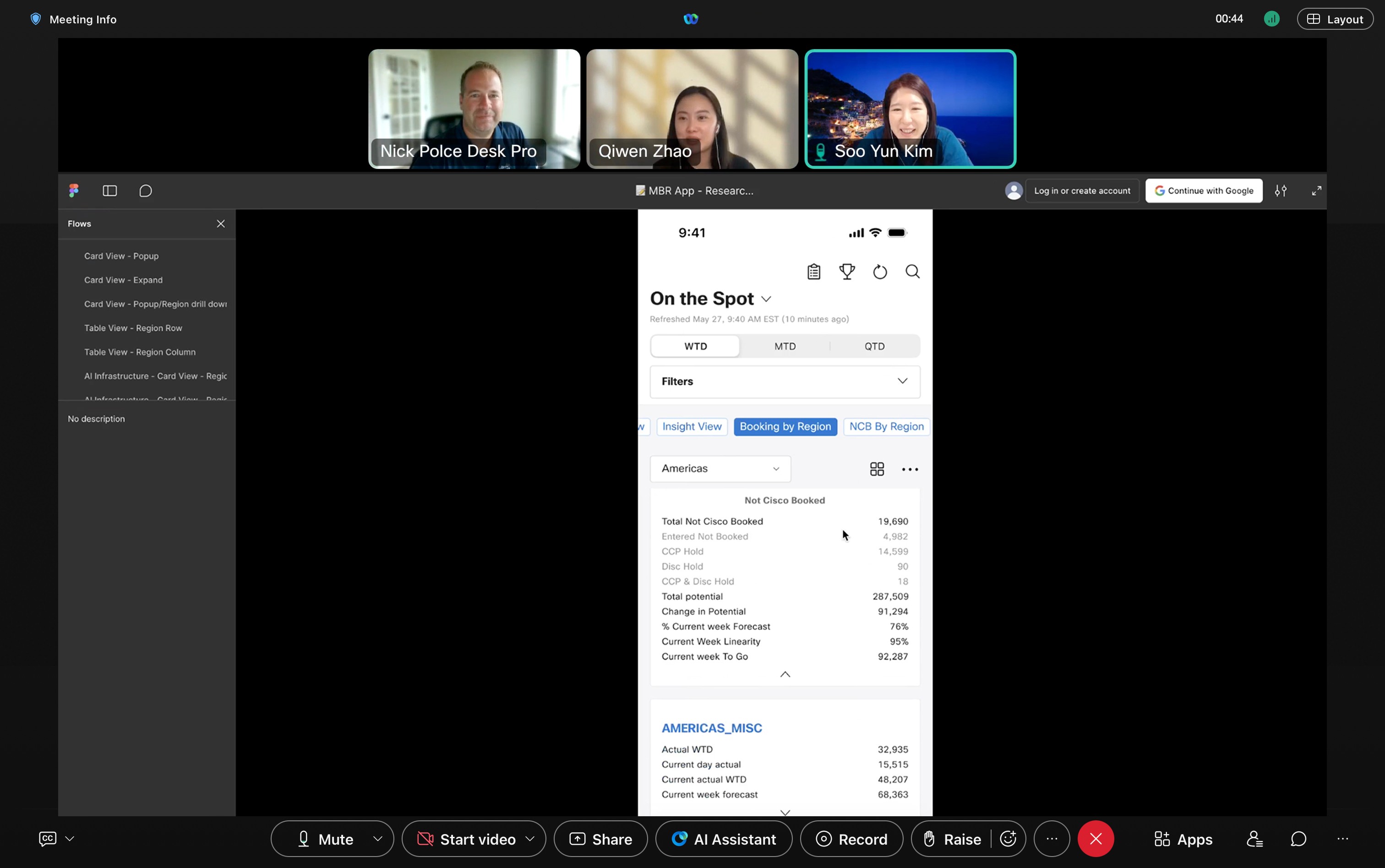
I partnered with a user researcher to run usability and concept testing with sixteen participants. We examined how users worked with key filters such as WTD, MTD, and QTD, and explored different timestamp display approaches to understand expectations around data refresh. These sessions highlighted the need for clearer hierarchy, more intuitive wording, and refined interaction patterns to better support everyday workflows.
Visual Design Process
Design Library
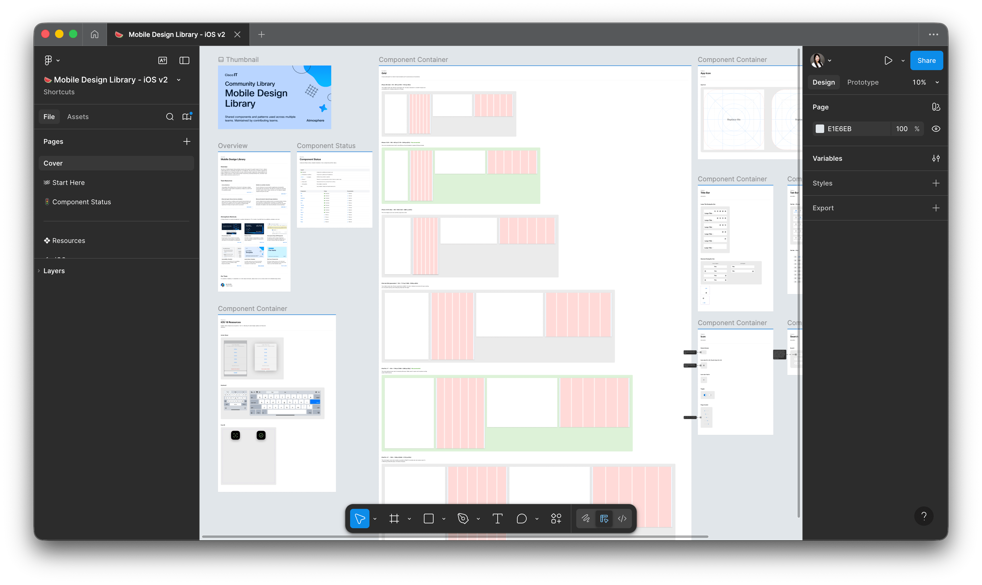
Prototypes
Visual Design Execution
App Icon
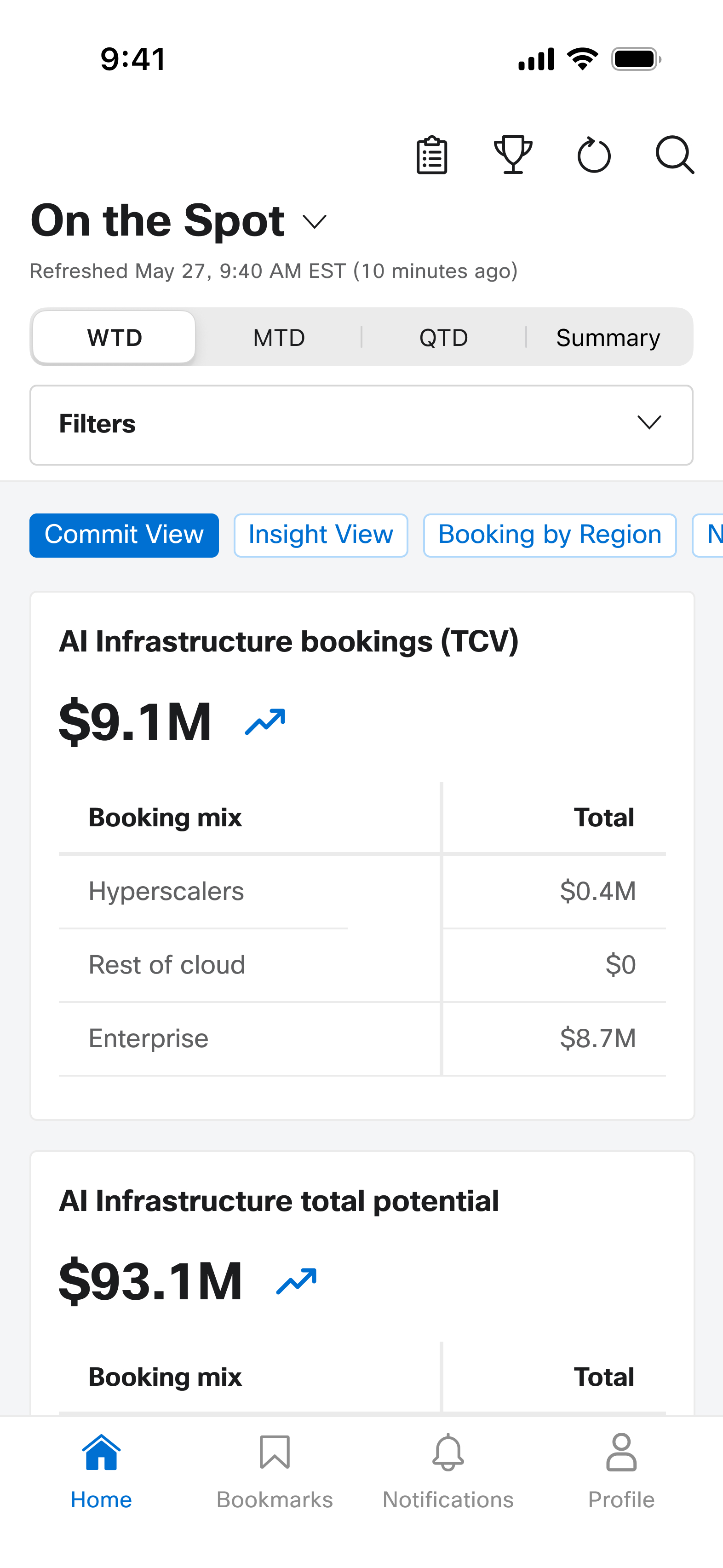
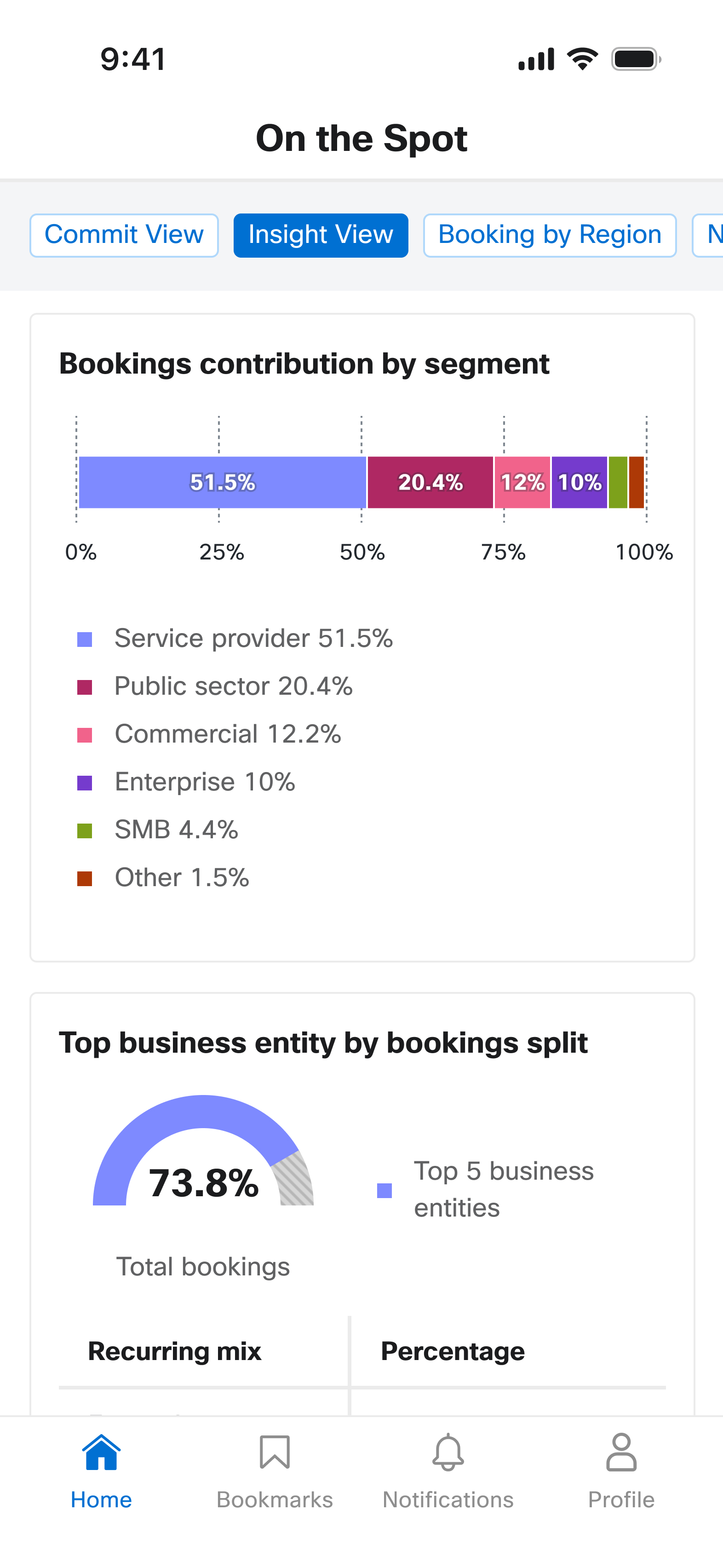
Data Visualization
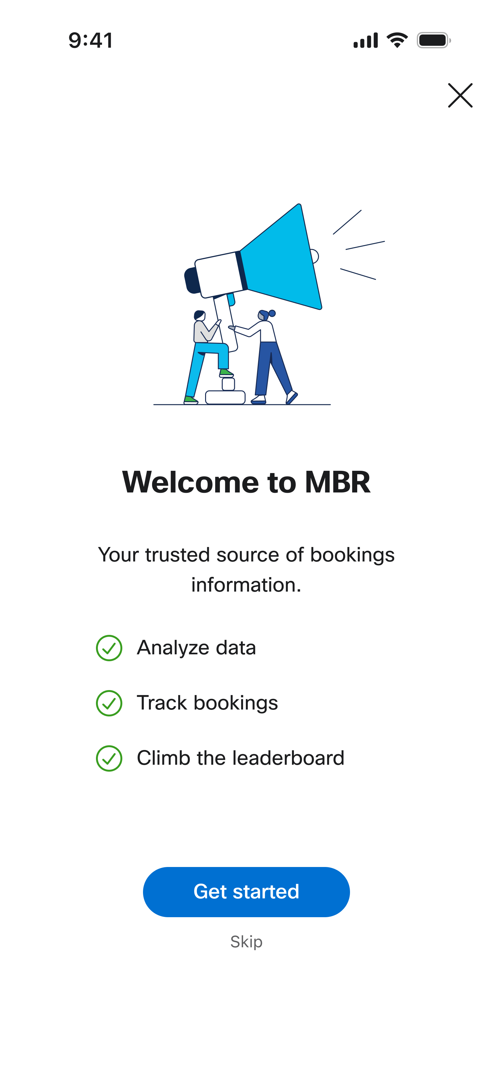
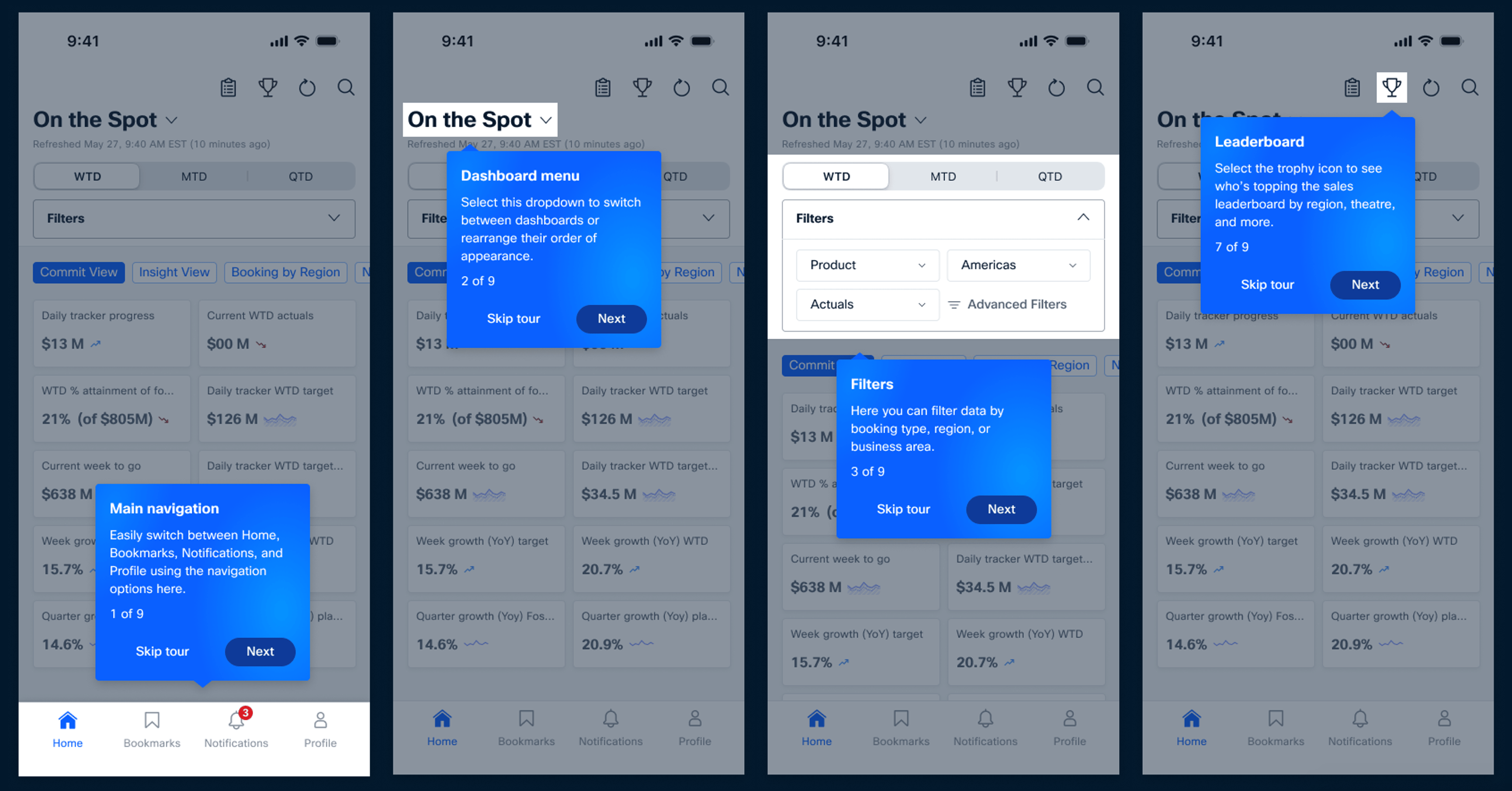
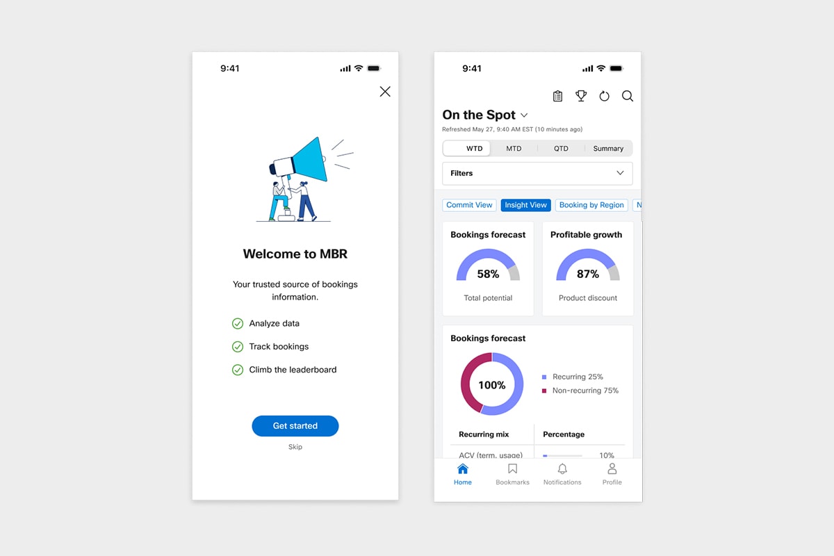
First Time User Experience – Onboarding
First Time User Experience - Tutorial
Navigation
Navigation (Before)
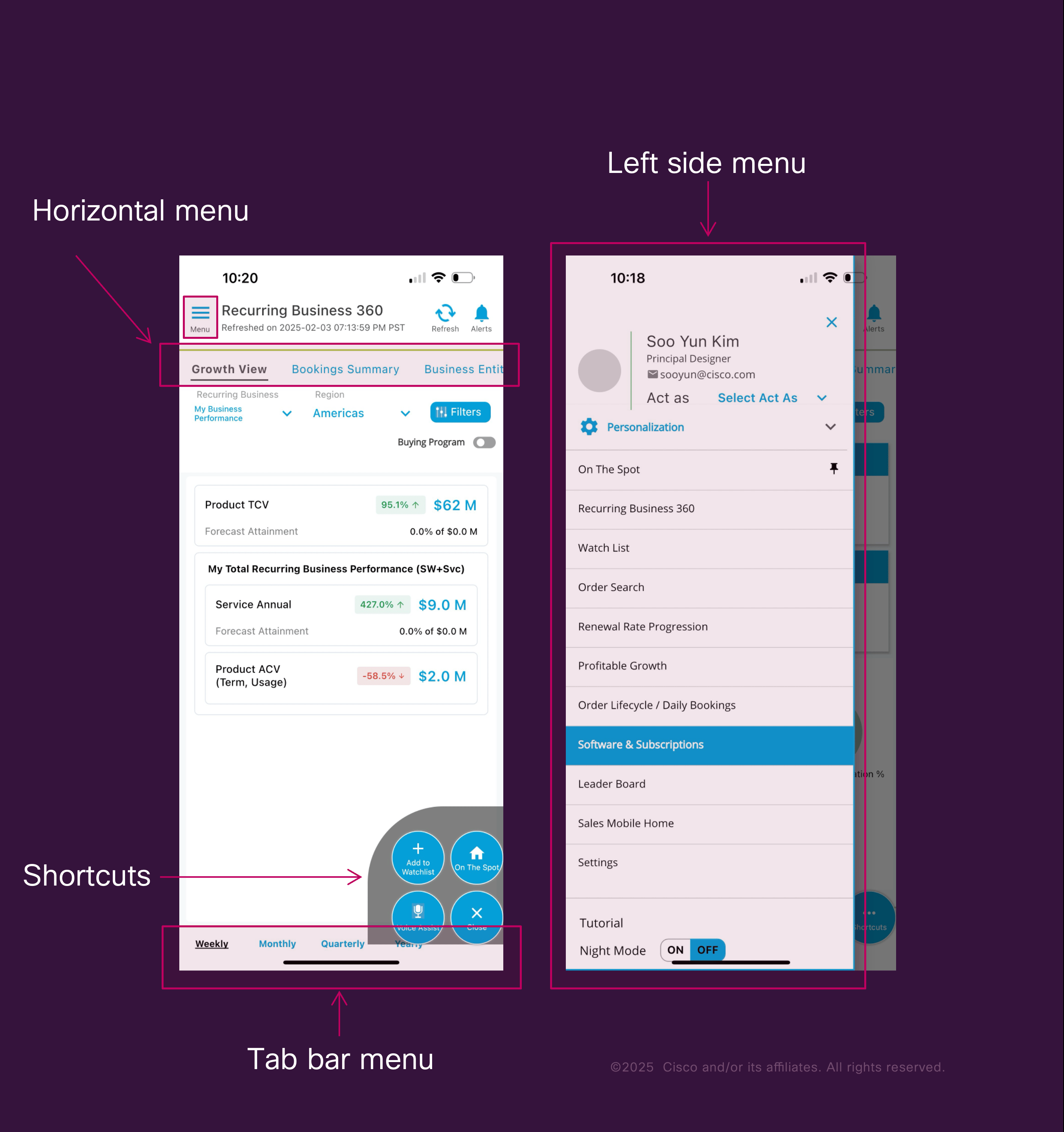
The previous navigation was difficult to use. Shortcuts were hidden, the horizontal menu’s additional options were unclear, and the hamburger menu was complex and inconsistent across screens.
Navigation (After)
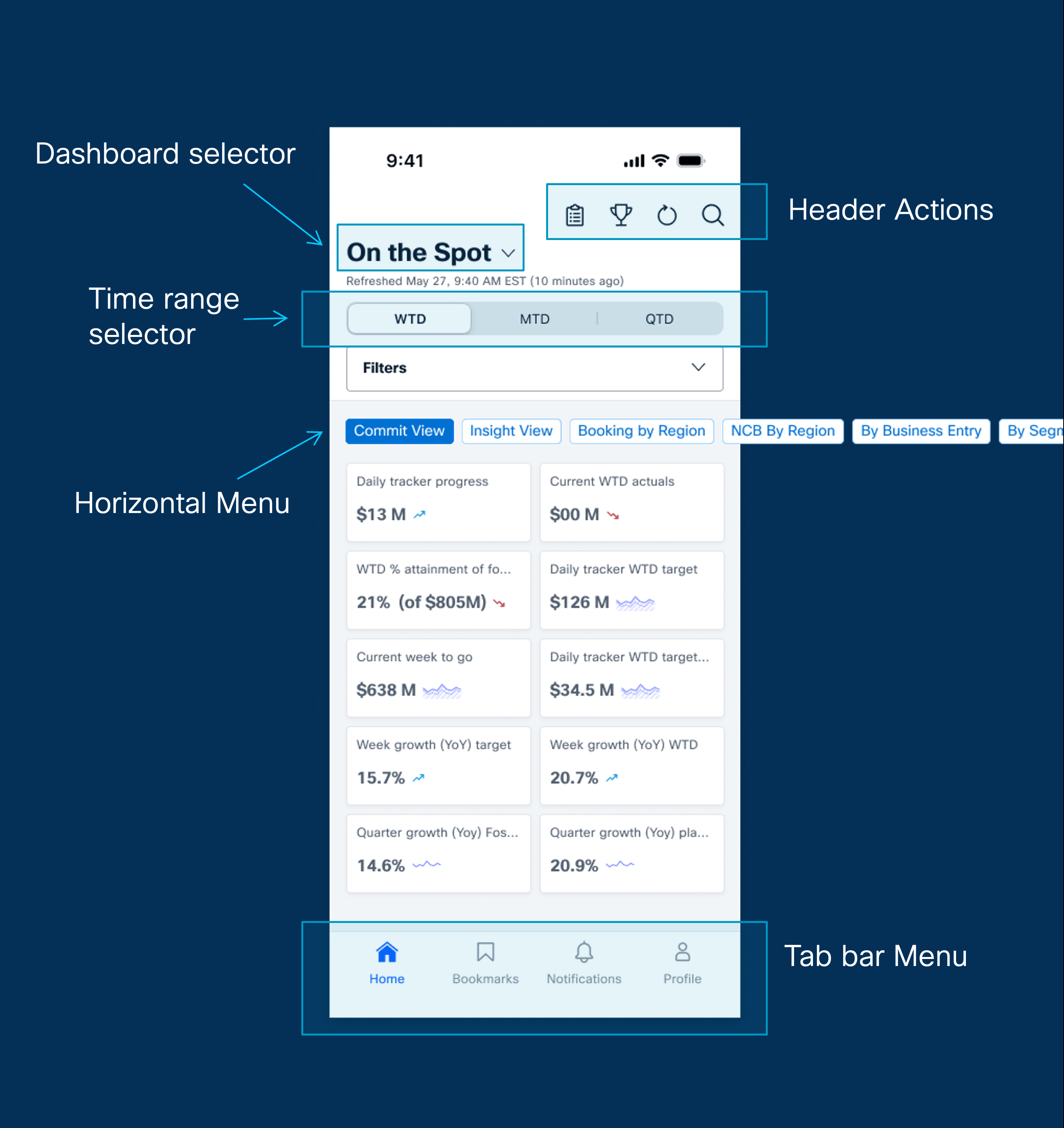
The new navigation is consistent, simple, and easy to explore. A clear tab bar, prominent header actions, and redesigned dashboard and horizontal menus make key features immediately visible and accessible.
Filter (Before)
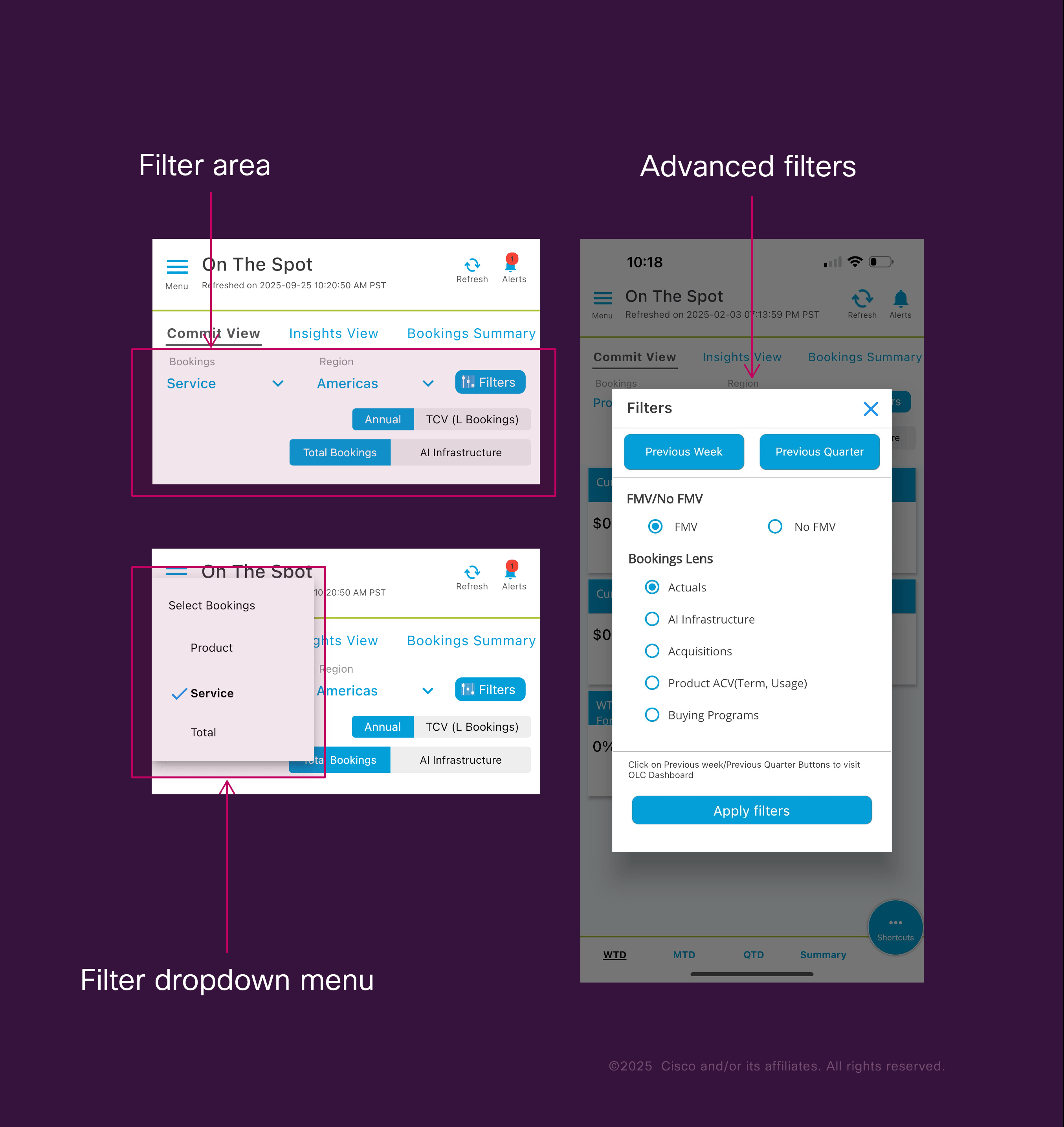
Filtering was confusing and hard to navigate. Options were spread across multiple layers, dropdowns felt outdated on mobile, and users often didn’t understand which filters were currently applied.
Filter (After)
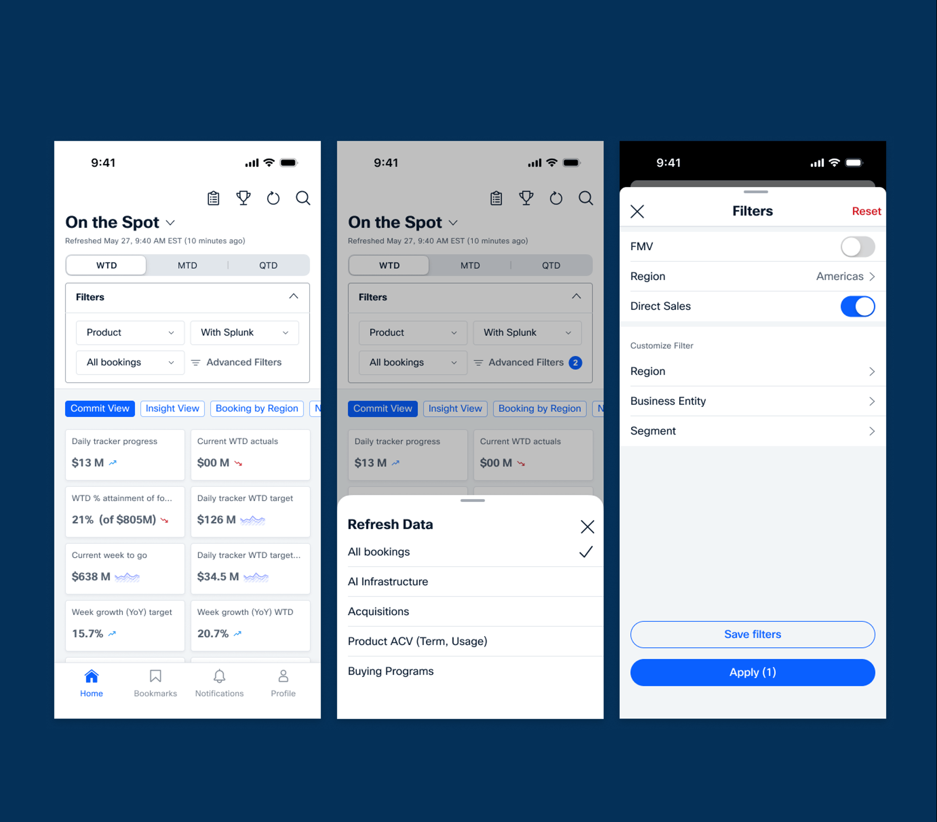
The new filter system is clear and modern with a defined hierarchy, collapsible sections, and detent-style pop-ups. Users can see applied filters at a glance and even save preferred combinations for future use.
AI Canvas Exploration
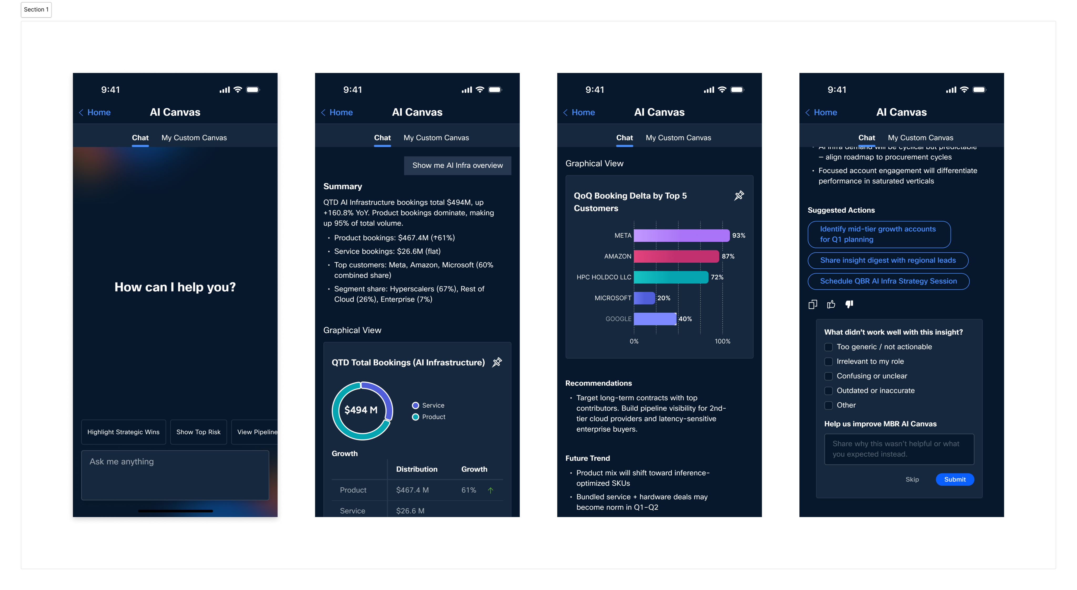
I explored an AI Canvas concept that helps sales and finance teams quickly understand AI infrastructure bookings. The design focuses on giving users a clear quarter-over-quarter view, highlighting what’s driving changes, and making it easy to share key insights with their teams.
What’s Next?
The next phase of the MBR App will include additional dashboards, deeper AI integration through features like AI Canvas, and expanded layouts for iPad and horizontal views. Future plans also explore voice assistant capabilities, smoother onboarding animations, and overall performance enhancements to deliver an even faster and more intelligent experience.
Conclusion
Through this redesign, we transformed a complex and fragmented experience into a streamlined and user-friendly one. The new MBR App was validated through user research and usability testing, delivering a more intuitive, mobile-first experience for sellers and leaders. This work also created a strong foundation for future enhancements, including deeper AI capabilities and expanded layouts.

sooyundesign@gmail.com



© Soo Yun Kim 2026 All Rights Reserved
MBR App
Creating an application that proactively provides actionable business insights and decision-making tools for Cisco leaders.
2025
Challenges
We set out to design an executive-facing application that transforms complex business data into clear, actionable insights. The goal was to enable Cisco’s senior leadership to make faster and more informed decisions by connecting AI-powered analytics, sales performance metrics, and financial reports into one cohesive experience.
One of the biggest challenges was simplifying a deeply technical system used across multiple business units while maintaining data accuracy and trust. The application needed to balance intelligence with usability—surfacing what mattered most without overwhelming the user. In addition, we were building for a wide range of roles, from regional leaders to executive vice presidents, which required flexible interaction patterns and scalable information architecture.
My Role: Lead Designer
As Lead Designer, I guided the end-to-end design vision for the MBR App, from strategy and research to delivery. I partnered closely with product managers, and engineers to translate business intelligence into intuitive visual experiences.
I led design explorations around navigation, filtering, and AI insight presentation, ensuring that every interaction supported quick comprehension and confident decision-making. I also helped define the visual direction and component consistency across web and mobile, aligning our design approach with Cisco’s evolving enterprise ecosystem.
Beyond design execution, I drove collaboration and alignment across stakeholder groups, helping leadership visualize the product’s potential through prototypes, storytelling, and strategic design reviews.
Intro - From Complexity to Simplicity
MBR – My Business Reports
My Business Reports (MBR) is an access-controlled, finance reporting tool and Cisco’s main source for legal bookings. Sellers use MBR to analyze data, track bookings and goals to hit targets.
While powerful for performance management, its web-based design can feel complex and data-heavy, making mobile a key opportunity to simplify and improve the experience.
What it is
The MBR App (My Business Reports App) is a mobile application designed to give sellers, leaders, and executives trusted access to Cisco’s official bookings information
— Your trusted source of bookings information. Access data on the go
Who uses it
6,000–7,000 active users, used heavily by sellers, financial leaders, and executives
— with high visibility across the business.
When it started
First launched in 2016, with a strong focus on iOS and less attention on Android.
MBR App Original Design
The original version of the MBR App offered valuable insights and tools, but the experience felt dense and difficult to navigate. Many useful features were hidden behind layers of menus, making it hard for users to find and act on key information.
Initial Process
Initial Timeline
I created the initial project timeline starting with the On-the-Spot Dashboard in Q3–Q4 as the core foundation. This was followed by navigation updates, prototyping, usability testing, development work, and the introduction of new features.
Technical Discussion
I led technical discussions with the development team and Atmosphere engineering to align on the foundation of the mobile experience. The work included defining the tech stack transition from React to Flutter, planning for dark and light mode accessibility, applying Atmosphere design patterns referenced from the Directory mobile app, and ensuring chart components could flexibly support various colors and layouts.
App Comparison Research
Navigation & Filtering
Redesigned navigation flow with smarter filtering using bottom modals, calendar selectors, and categorized options.
Data Interaction
Interactive charts, tap-to-expand details, and clearer hierarchy for easier data exploration.
Dashboard Usability
Save and organize frequently used views for better discoverability and usability.
Onboarding Experience
Contextual tooltips and lightweight guidance to help users get started quickly.
I conducted a comparative analysis of leading enterprise applications to identify best practices in filtering, data visualization, navigation, and onboarding. The research involved heuristic evaluation and UI/UX pattern analysis across four apps: Google Ads, Charles Schwab, Google Analytics, and Salesforce CRM Analytics.
Research
In-depth User Interview
In-depth interviews with nine participants across five roles highlighted the need for more detailed booking information, as the current dashboard only shows high-level totals. Participants also struggled with personalization, repeatedly rebuilding their preferred views. Overall, users valued the app’s capabilities but wanted a more intuitive design with dashboards that better support their core tasks.
Brainstorming Workshop
As part of our brainstorming workshop, the team generated a range of ideas to simplify the experience and support key workflows. The highlights included one-tap access to the details table, an always-visible search bar, customizable default dashboard landing, direct filter saving on mobile, a simplified details table, tailored in-app training, and notification subscriptions.
Kano Analysis via Survey
I collaborated with a user researcher to conduct a survey-based Kano analysis and surface key experience opportunities. A simple but meaningful improvement involved allowing users to open the detailed table with a single tap. Higher-effort features, such as mobile notification subscriptions and saving filter preferences, showed strong long-term value. The analysis also highlighted the need to refine filtering and customization options within the detailed table to better support day-to-day tasks.
Usability and Concept Testing
I partnered with a user researcher to run usability and concept testing with sixteen participants. We examined how users worked with key filters such as WTD, MTD, and QTD, and explored different timestamp display approaches to understand expectations around data refresh. These sessions highlighted the need for clearer hierarchy, more intuitive wording, and refined interaction patterns to better support everyday workflows.
Visual Design Process
Design Library
Prototypes
Visual Design Execution
App Icon
Data Visualization
First Time User Experience – Onboarding
First Time User Experience - Tutorial
Navigation
Navigation (Before)
The previous navigation was difficult to use. Shortcuts were hidden, the horizontal menu’s additional options were unclear, and the hamburger menu was complex and inconsistent across screens.
Navigation (After)
The new navigation is consistent, simple, and easy to explore. A clear tab bar, prominent header actions, and redesigned dashboard and horizontal menus make key features immediately visible and accessible.
Filter (Before)
Filtering was confusing and hard to navigate. Options were spread across multiple layers, dropdowns felt outdated on mobile, and users often didn’t understand which filters were currently applied.
Filter (After)
The new filter system is clear and modern with a defined hierarchy, collapsible sections, and detent-style pop-ups. Users can see applied filters at a glance and even save preferred combinations for future use.
AI Canvas Exploration
I explored an AI Canvas concept that helps sales and finance teams quickly understand AI infrastructure bookings. The design focuses on giving users a clear quarter-over-quarter view, highlighting what’s driving changes, and making it easy to share key insights with their teams.
What’s Next?
The next phase of the MBR App will include additional dashboards, deeper AI integration through features like AI Canvas, and expanded layouts for iPad and horizontal views. Future plans also explore voice assistant capabilities, smoother onboarding animations, and overall performance enhancements to deliver an even faster and more intelligent experience.
Conclusion
Through this redesign, we transformed a complex and fragmented experience into a streamlined and user-friendly one. The new MBR App was validated through user research and usability testing, delivering a more intuitive, mobile-first experience for sellers and leaders. This work also created a strong foundation for future enhancements, including deeper AI capabilities and expanded layouts.
sooyundesign@gmail.com
© Soo Yun Kim 2026 All Rights Reserved
MBR App
Creating an application that proactively provides actionable business insights and decision-making tools for Cisco leaders.
2025
Challenges
We set out to design an executive-facing application that transforms complex business data into clear, actionable insights. The goal was to enable Cisco’s senior leadership to make faster and more informed decisions by connecting AI-powered analytics, sales performance metrics, and financial reports into one cohesive experience.
One of the biggest challenges was simplifying a deeply technical system used across multiple business units while maintaining data accuracy and trust. The application needed to balance intelligence with usability—surfacing what mattered most without overwhelming the user. In addition, we were building for a wide range of roles, from regional leaders to executive vice presidents, which required flexible interaction patterns and scalable information architecture.
My Role: Lead Designer
As Lead Designer, I guided the end-to-end design vision for the MBR App, from strategy and research to delivery. I partnered closely with product managers, and engineers to translate business intelligence into intuitive visual experiences.
I led design explorations around navigation, filtering, and AI insight presentation, ensuring that every interaction supported quick comprehension and confident decision-making. I also helped define the visual direction and component consistency across web and mobile, aligning our design approach with Cisco’s evolving enterprise ecosystem.
Beyond design execution, I drove collaboration and alignment across stakeholder groups, helping leadership visualize the product’s potential through prototypes, storytelling, and strategic design reviews.
Intro - From Complexity to Simplicity
MBR – My Business Reports
My Business Reports (MBR) is an access-controlled, finance reporting tool and Cisco’s main source for legal bookings. Sellers use MBR to analyze data, track bookings and goals to hit targets.
While powerful for performance management, its web-based design can feel complex and data-heavy, making mobile a key opportunity to simplify and improve the experience.
What it is
The MBR App (My Business Reports App) is a mobile application designed to give sellers, leaders, and executives trusted access to Cisco’s official bookings information
— Your trusted source of bookings information. Access data on the go
Who uses it
6,000–7,000 active users, used heavily by sellers, financial leaders, and executives
— with high visibility across the business.
When it started
First launched in 2016, with a strong focus on iOS and less attention on Android.
MBR App Original Design
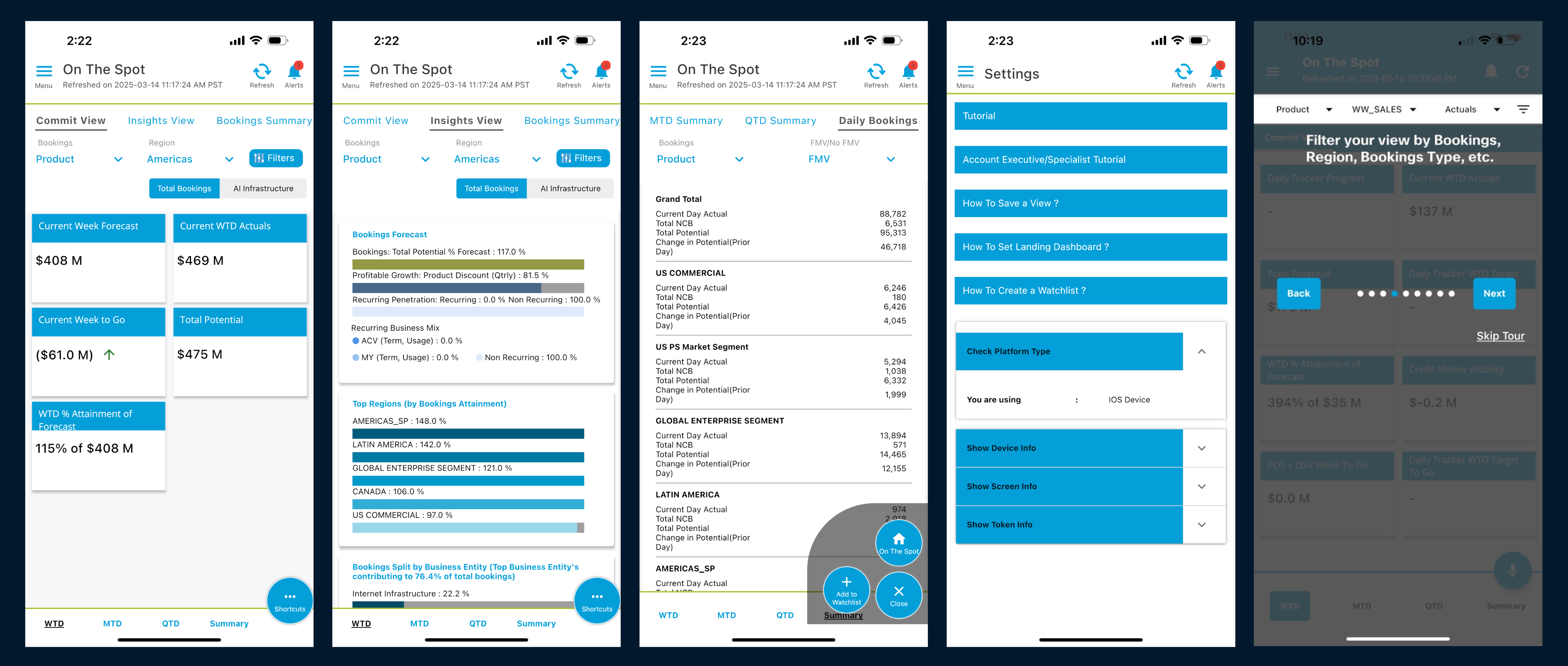
The original version of the MBR App offered valuable insights and tools, but the experience felt dense and difficult to navigate. Many useful features were hidden behind layers of menus, making it hard for users to find and act on key information.
Initial Process
Initial Timeline
I created the initial project timeline starting with the On-the-Spot Dashboard in Q3–Q4 as the core foundation. This was followed by navigation updates, prototyping, usability testing, development work, and the introduction of new features.
Technical Discussion
I led technical discussions with the development team and Atmosphere engineering to align on the foundation of the mobile experience. The work included defining the tech stack transition from React to Flutter, planning for dark and light mode accessibility, applying Atmosphere design patterns referenced from the Directory mobile app, and ensuring chart components could flexibly support various colors and layouts.
App Comparison Research
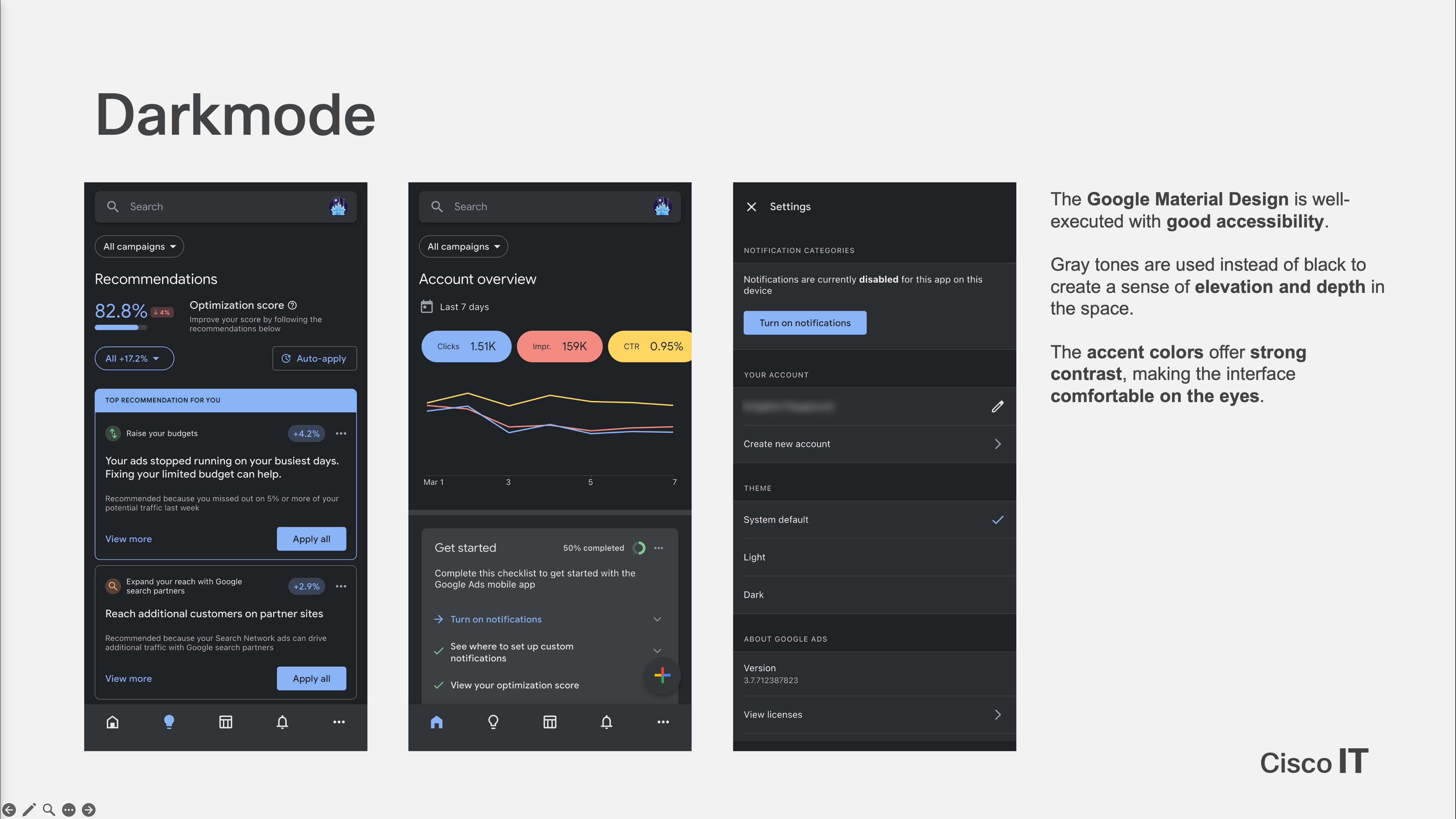
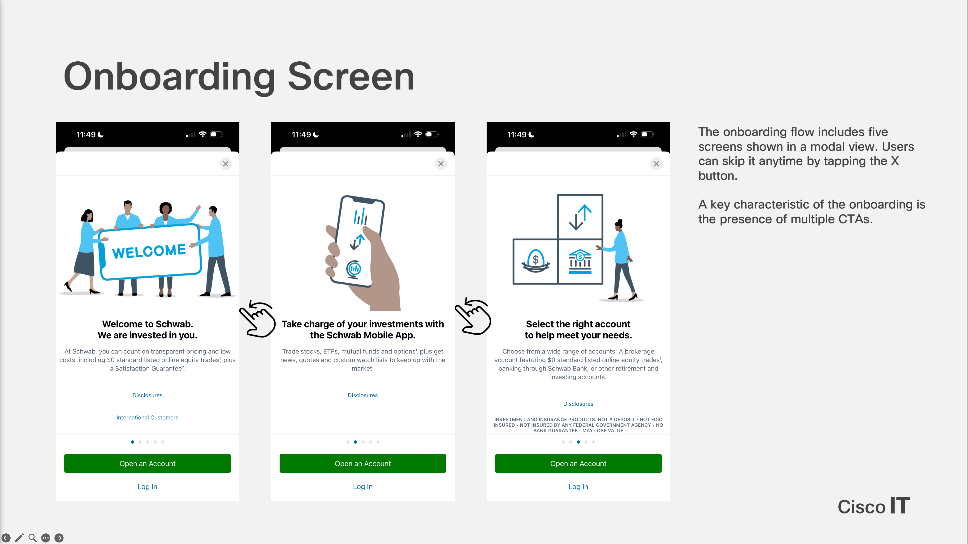
I conducted a comparative analysis of leading enterprise applications to identify best practices in filtering, data visualization, navigation, and onboarding. The research involved heuristic evaluation and UI/UX pattern analysis across four apps: Google Ads, Charles Schwab, Google Analytics, and Salesforce CRM Analytics.
Navigation & Filtering
Redesigned navigation flow with smarter filtering using bottom modals, calendar selectors, and categorized options.
Data Interaction
Interactive charts, tap-to-expand details, and clearer hierarchy for easier data exploration.
Dashboard Usability
Save and organize frequently used views for better discoverability and usability.
Onboarding Experience
Contextual tooltips and lightweight guidance to help users get started quickly.
Research
In-depth User Interview
In-depth interviews with nine participants across five roles highlighted the need for more detailed booking information, as the current dashboard only shows high-level totals. Participants also struggled with personalization, repeatedly rebuilding their preferred views. Overall, users valued the app’s capabilities but wanted a more intuitive design with dashboards that better support their core tasks.
Brainstorming Workshop
As part of our brainstorming workshop, the team generated a range of ideas to simplify the experience and support key workflows. The highlights included one-tap access to the details table, an always-visible search bar, customizable default dashboard landing, direct filter saving on mobile, a simplified details table, tailored in-app training, and notification subscriptions.
Kano Analysis via Survey
I collaborated with a user researcher to conduct a survey-based Kano analysis and surface key experience opportunities. A simple but meaningful improvement involved allowing users to open the detailed table with a single tap. Higher-effort features, such as mobile notification subscriptions and saving filter preferences, showed strong long-term value. The analysis also highlighted the need to refine filtering and customization options within the detailed table to better support day-to-day tasks.
Usability and Concept Testing
I partnered with a user researcher to run usability and concept testing with sixteen participants. We examined how users worked with key filters such as WTD, MTD, and QTD, and explored different timestamp display approaches to understand expectations around data refresh. These sessions highlighted the need for clearer hierarchy, more intuitive wording, and refined interaction patterns to better support everyday workflows.
Visual Design Process
Design Library
Prototypes
Visual Design Execution
App Icon
Data Visualization
First Time User Experience – Onboarding
First Time User Experience - Tutorial
Navigation
Navigation (Before)
The previous navigation was difficult to use. Shortcuts were hidden, the horizontal menu’s additional options were unclear, and the hamburger menu was complex and inconsistent across screens.
Navigation (After)
The new navigation is consistent, simple, and easy to explore. A clear tab bar, prominent header actions, and redesigned dashboard and horizontal menus make key features immediately visible and accessible.
Filter (Before)
Filtering was confusing and hard to navigate. Options were spread across multiple layers, dropdowns felt outdated on mobile, and users often didn’t understand which filters were currently applied.
Filter (After)
The new filter system is clear and modern with a defined hierarchy, collapsible sections, and detent-style pop-ups. Users can see applied filters at a glance and even save preferred combinations for future use.
AI Canvas Exploration
I explored an AI Canvas concept that helps sales and finance teams quickly understand AI infrastructure bookings. The design focuses on giving users a clear quarter-over-quarter view, highlighting what’s driving changes, and making it easy to share key insights with their teams.
What’s Next?
The next phase of the MBR App will include additional dashboards, deeper AI integration through features like AI Canvas, and expanded layouts for iPad and horizontal views. Future plans also explore voice assistant capabilities, smoother onboarding animations, and overall performance enhancements to deliver an even faster and more intelligent experience.
Conclusion
Through this redesign, we transformed a complex and fragmented experience into a streamlined and user-friendly one. The new MBR App was validated through user research and usability testing, delivering a more intuitive, mobile-first experience for sellers and leaders. This work also created a strong foundation for future enhancements, including deeper AI capabilities and expanded layouts.
sooyundesign@gmail.com
© Soo Yun Kim 2026 All Rights Reserved